Lincoln Park Wedding at North Pond
June 17, 2025
This Ginkgo leaf icon elegantly nods to the setting for this wedding celebration. Personalizing your invitations makes all the difference.

This Ginkgo leaf icon elegantly nods to the setting for this wedding celebration. Personalizing your invitations makes all the difference.
Color envelopes and two color printing can add some color to your wedding invitation suite.


Are you considering a winter wedding? Take some inspiration from this jewel-toned dark teal invitation suite for an oceanside New York Wedding at Bourne Mansion. The Wedding Day Stationary tucked beautifully into evergreen boughs, candlelight, and pops of red. Even the bride's bird was up for the festivities. The couple offered beautiful Colorado Blue Spruce Saplings as favors.


An envelope liner or a printed belly band can add a sense of refinement and polish to your wedding stationery. Belly bands also help organize multiple card suites inside the envelope.


This beautiful wedding suite features our Modern Garden design with a two color customization to invite guests to experience the splendor of Cornwell Manor in The Cotswolds, UK. Shayna and Marc's wedding was featured on Smashing the Glass with photos by Abul.


Melissa and Timothy stylized their stationery with nautical touches and a custom map envelope liner for their wedding at Mason's Island Yacht Club in Mystic, Connecticut.


This elegant stationery was customized to highlight the best of San Francisco with a ceremony at Grace Cathedral and reception at the Fairmont Hotel.


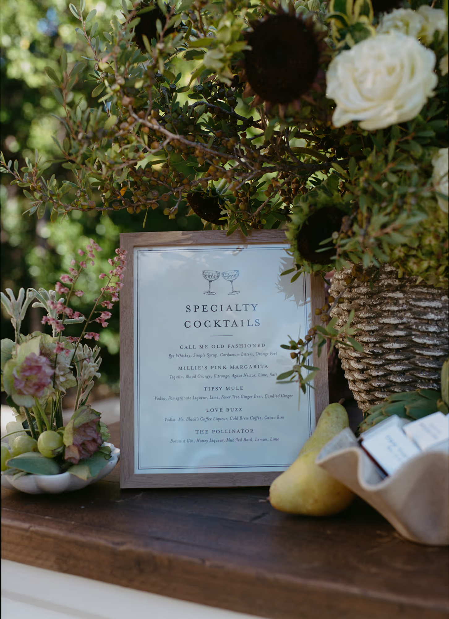
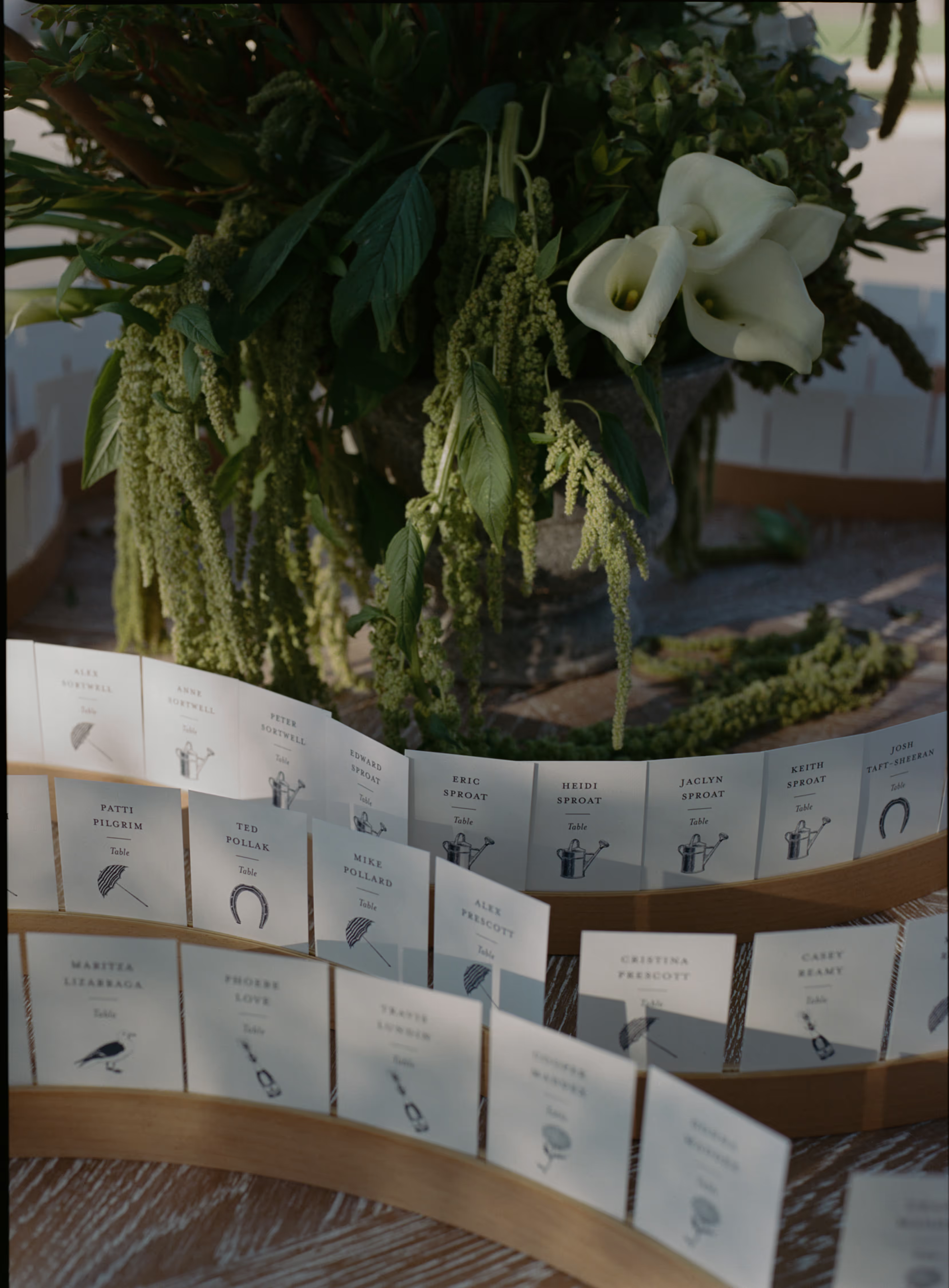
Wedding day stationary helps guide your guests through your various Wedding events from the ceremony to cocktails, menus, and seating arrangements. Creating a consistent look that reflects your invitation design enhances the decorative elements of your wedding decorations and decor. We worked with Olivia and Griffin's wedding planner, Nina Moore, to create the perfect programs, cocktail signs, table and escort cards, and personalized menus for a seamless celebration.