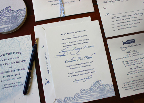
Red, White and Blue wedding invitations

July 6, 2014

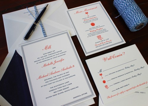
Admittedly, this wedding didn't take place on July 4th. But the color scheme certainly seems appropriate for this holiday weekend! We printed this set for a May wedding last year and we adore the mix of elegance and informality.

monogram-summer-letterpress-wedding-invitation

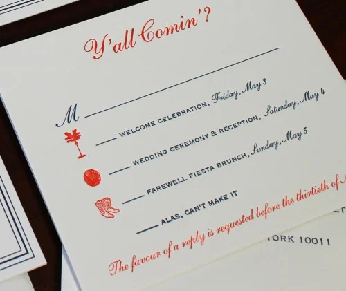
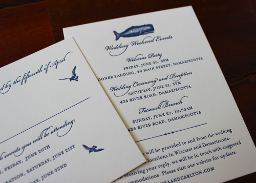
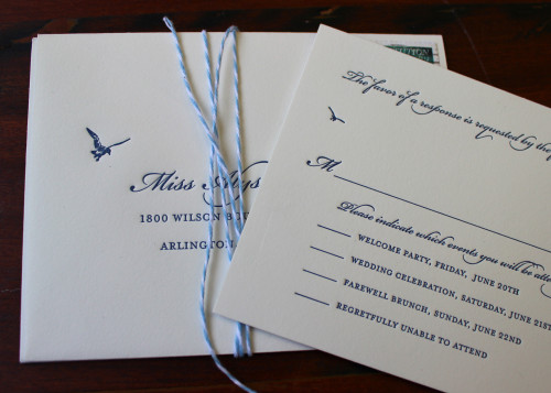
The invitation itself maintains a more traditional look with the triple border and monogram. Meanwhile, the other pieces are a little more whimsical and feature some really lovely illustrations. We especially like how the motifs on the information card correspond to the RSVP card.

monogram-summer-south-carolina-letterpress-wedding-rsvp

Greek wedding invitation

July 3, 2014

navy-blue-greek-english-letterpress-wedding-invitation

This summer, we have been printing a range of dual-language invitations. It's a fun challenge for us to lay these out and we have the added benefit of daydreaming about events on Greek islands, Italian hillsides and French chateaus!

This invitation includes text in both English and Greek. We aimed to have both sections of copy arranged similarly so that they mirror each other and there is plenty of space left on the design so that it doesn't look too "text-y".

The bride asked the extremely talented Roanne Adams from RoAndCo to design the custom monogram and we think it is so charming. The subtle olive branches refer to the Greek heritage of the bride and the location of the wedding.

navy-blue-greek-letterpress-wedding-rsvp

More custom lined envelopes

June 30, 2014

green-floral-lined-envelope-letterpress-custom-stationery

We printed a selection of social stationery for a newly-married couple. The clients selected a few different designs and cardstocks. To add another layer of customization, they selected a beautiful printed paper from Paper Source and we used it to line their envelopes.

This is a great option to add individuality to your stationery. It adds some lovely visual appeal as the recipient opens the envelope and also complements the ink used for the letterpress printing.

green-floral-lined-envelope-letterpress-monogram-notecard

Rabbit notecards

June 26, 2014

grey-baby-bunny-rabbit-letterpress-stationery-sesame

Designing and printing social stationery is one of our favorite tasks here at Sesame. It's a great opportunity for clients to display their individual style. We printed some really sweet notecards for a little girl and we love how the rabbit illustration looks next to her name.

The font is whimsical yet elegant and the ink color veers away from being gender-specific while still looking warm and pretty.

We hope you enjoy your stationery, Lola!

Early Summer Maritime Invitations

June 23, 2014

navy-blue-summer-wave-ocean-maritime-letterpress-wedding-invitation

This set of invitations is a customized version of one of our collection designs. We love how it looks in shades of navy and paler blue. This wedding took place on the coast of Maine so the waves, whales and seabirds are perfect illustrations.

We love all the pieces reference each other in terms of color, font and motifs but they equally stand alone as beautiful printed items.

navy-blue-summer-whale-ocean-maritime-letterpress-wedding-rsvp

We made the RSVP envelopes even more special by incorporating some sweet little bird illustrations around the address.

navy-blue-seagull-ocean-maritime-letterpress-wedding-rsvp

Overall, we adore this design: look out for it added to our collection! And don't forget that you can complement your custom printing with items from our retail line. Our wave coasters make perfect favors and the whale or wave gift tags could be used as escort cards!

Ampersand

June 20, 2014

floral-ampersand-gold-black-letterpress-wedding-invitation

Alison Corrie and Morgan Sheasby collaborated on their wedding invitation design; what a lovely pre-wedding design task for these soon-to-be newlyweds! They chose one of our favorite color schemes: matte gold and black. They incorporated really lovely design elements; the subtle floral embellishments, the wine glass and sled and - our favorite of all - that awesome linked ampersand.

Tangerine ink and blind embossing

June 17, 2014

We have been printing loads of wedding invitations from designer-supplied files lately. We love seeing all the different styles and ideas that graphic designers come up with. It's wonderful to work closely with other artists and craftspeople to collaborate on their designs.Here's a recent invitation we printed:

blind-texture-tangerine-orange-modern-letterpress-wedding-invitation

The design features a blind-embossed background pattern overlaid with bold, chunky text in a gorgeous pale apricot color. We love how tactile this card is and how it plays with traditional notions of wedding invitations.

The design is by the very talented Tim Geesman and his Thank You card layout is no less awesome.

heart-tangerine-orange-modern-letterpress-wedding-thanks-notecard

Again, the design is really clever: we love the subtle customization of the initials in the heart. Thanks Tim and Kate for working with us on your printing!

Bespoke envelope lining

June 9, 2014

Most of our printing is custom: our clients love having personalized items with their name/monogram or other individual details included. And for an additional bespoke element, how about choosing your own paper to line envelopes? You can go for something simple in a single color or choose a really unique fine paper with a pattern or design.We love how the ink color used on this thank you card is picked up in the verdant lining paper used for the envelopes:

green-floral-envelope-lining-letterpress-stationery