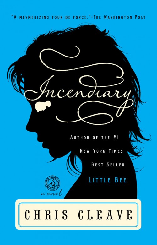
Our friends over at Felt and Wire just did a really nice post on silhouettes in graphic design. I love Roberto de Vicq’s book covers for author Chris Cleave and it was an honor to be included in the same post.
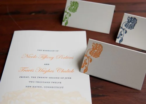
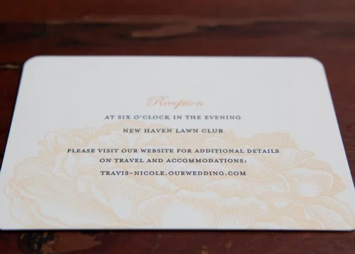
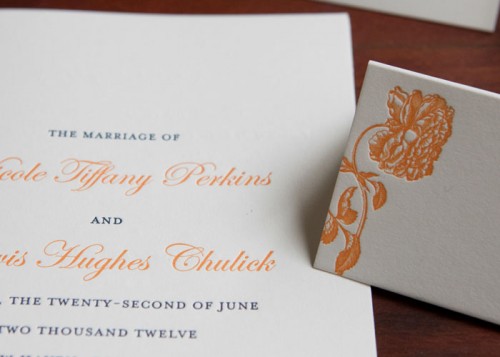
We've been printing many menus and programs for our wedding clients this month. One of the prettiest ones we've worked on is this set of reception stationery featuring a peony image. We worked with the couple to customize the Magnolia wedding invitation design from our website. In place of the blue magnolia blossom, they selected a vintage peony illustration to print in a pale tangerine color. The accompanying cards in the suite had larger details of the floral image. We continued the look for the programs and escort cards shown here.
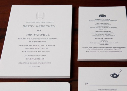
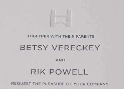
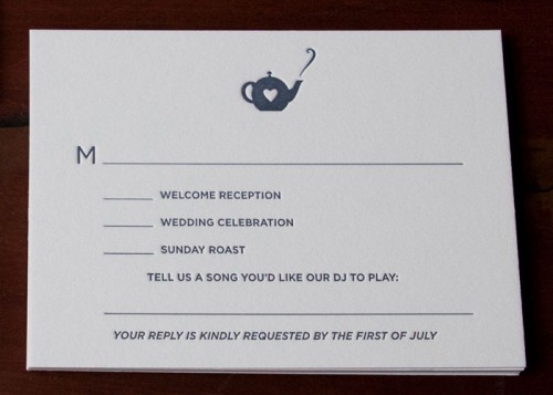
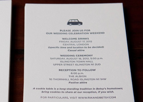
The Spring has been busy at the studio, printing custom jobs like wedding stationery, business cards and note cards and also developing new items for our retail/wholesale line. We tend to be so busy designing and printing that we never get a chance to stop to post updates on our site and blog. Now that the busiest season is past, we're finally catching our breath and going back through our pictures to share details of the work we have been doing.We'll start with one of our favorite designs for a wedding taking place in London. We love the simple and clean type, with the British icons in the dusty blue and gray ink.
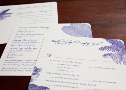
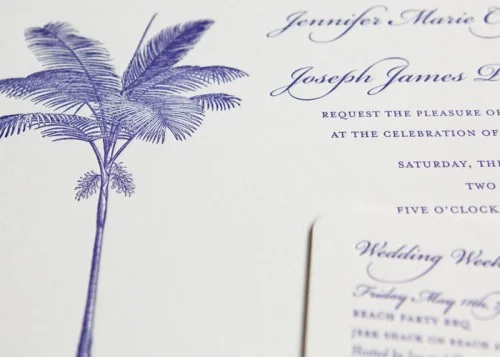
We often collaborate with couples to design invitation suites for destination weddings. One of the fun challenges is to develop a design that complements the setting of the wedding but also maintains the style of the couple. For this Jamaican invitation suite, we worked with a selection of vintage palm tree images and printed everything in a rich blue ink. The darker ink and one color printing give the set a sophisticated look, which was fitting for the stylish (and really sweet) couple.
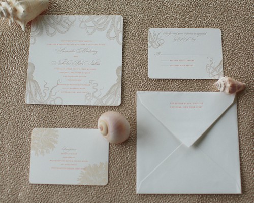
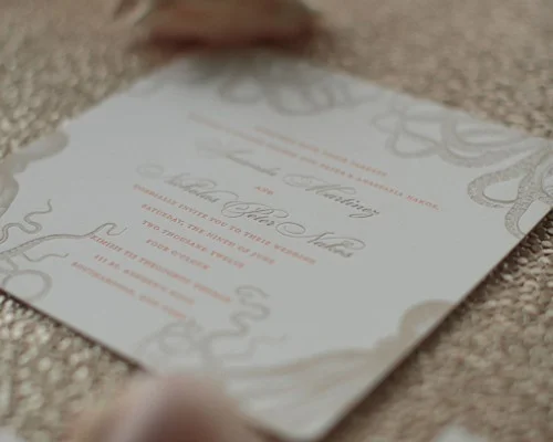
We designed and printed this Octopus design for a couple last year and loved the charming way the creature framed the formal wedding text. It is the kind of unexpected and elegant look we absolutely love. We were thrilled to have the opportunity to revisit this design again but incorporate new imagery and colors. Here are some pictures that the couple's photographer, Carmen Santorelli, was generous to share with us.
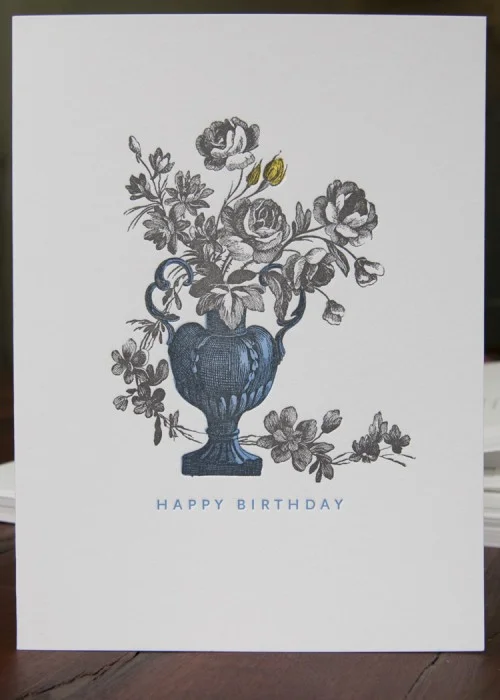
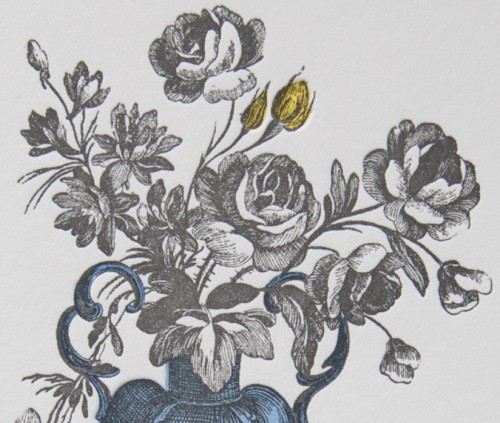
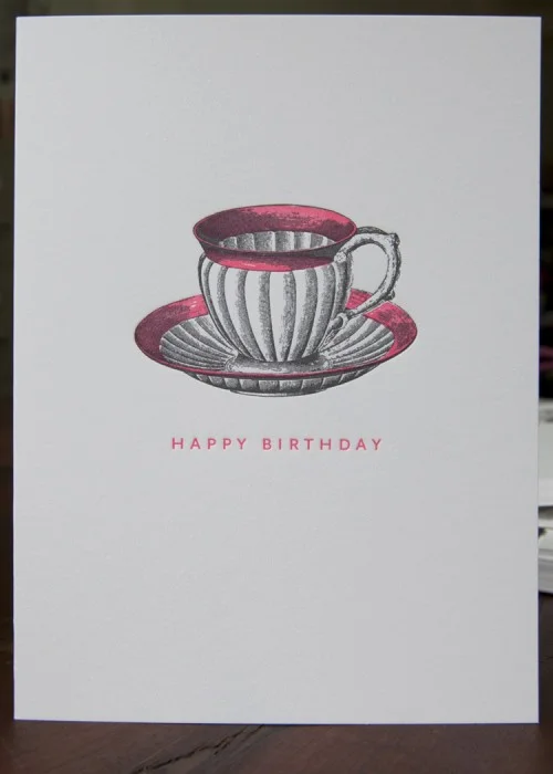
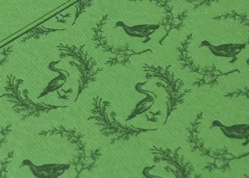
I love traditional still life paintings with rich and moody colors. Our newest line of cards is inspired by this admiration. We've taken vintage etchings and experimented with coloring details of the pictures (having a five year old daughter, I spend a fair amount of time coloring in pictures...). We settled on a pairing of ultra bright ink for the detail painting and then darker grays for the overlaying images. We're always looking to link our love of 19th Century everything with 21st Century style.
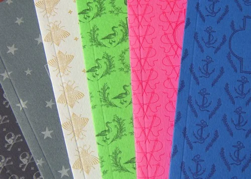
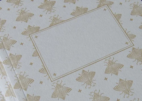
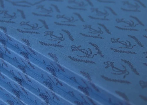
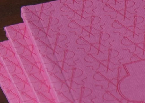
We've been so busy this Spring with wedding invitations, note cards and designing and printing our new items that we've neglected the blog for a while. Now that our Spring line is finished, we're finally getting a chance to show what we've been working on. We're particularly excited about our journals. We printed 6 cover designs on beautiful Fabriano paper and had them perfect bound at a bindery around the corner from our studio in Brooklyn. It is a little more expensive to produce things here in New York City but we like to be able to support other local manufacturing businesses and the quality is so nice when someone is making and checking each piece by hand. Here are some images of the new books.
One of our bespoke, monogrammed coasters has been featured in Martha Stewart Real Weddings! A great complement to any formal dining experience or a reception bar.


