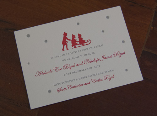
Last year, one of our clients got a couple of wonderful Christmas presents: newborn twins! We worked with her to design and print a lovely, festive birth announcement which celebrated the new arrivals:
The combination of bright red and matte silver is perfect for the holiday season and we love how the image works perfectly for the family!
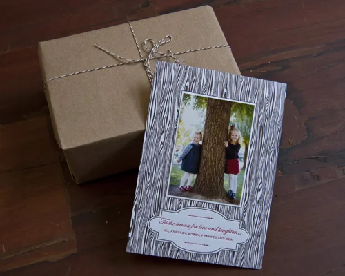
Around this time of year, we are always busy printing custom holiday cards for our clients. We really enjoy getting into the spirit of the holidays, even though we still haven't even celebrated Thanksgiving!Last year we printed a really cute photo card which was designed to look like wood grain. Also known as faux bois, this technique was perfect for letterpress. We love how this card came out and think it perfectly captures the wintery theme.
Annsley1
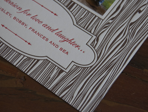
And here's a close up of the detail of the faux bois:
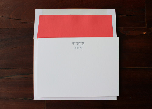
Sorry we've been off the radar a little lately. We've had some exciting press in the New York Times and it's brought in lots of lovely orders in time for the holidays.The New York Times featured our spectacle notecards in their gift guide: you can read all about it here.
And in case you want a peek at the notecards in question, here's they are, complete with a gorgeous coral-red envelope liner.
Lotta is a long-time friend and we've joined forces to design a gorgeous, contemporary range which links Lotta's beloved illustrations and bright color palette with Sesame Letterpress’s luxurious letterpress printing.
Both of the designs are available in a choice of two fonts and four colors.
And if you're not getting married, but you still love Lotta's pared-back designs, why not get some thank you cards printed in time for the holidays?
Please do take a look at our website for more photos of this range and details about how to place an order.
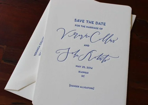
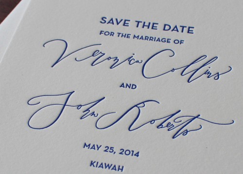
Our second Save the Date for a Kiawah Island wedding is totally different. This is one of the nicest things about working with couples on their wedding stationery: no two couples come up with the same idea.This Save the Date is simpler and completely text-based. The couple wanted the beauty of Betsy Dunlap's calligraphy to shine through.
This is such a wonderful way to really customize your wedding stationery: hire a calligrapher to render your names in a unique, one-of-a-kind font and then build the rest of the design around those words.
Here's a more detailed image of the letterpress impression of Betsy's calligraphy:
It fun for us to try out different fonts to work alongside this handwritten cursive. We opted for Neutra Caps which has a clean, contemporary feel. And that blue is marvellous!
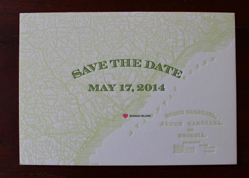
Kiawah Island in South Carolina is a pretty magical place. Which could explain why we had a few couples work with us this season on Save the Dates for their 2014 weddings on the island.So first of all, feast your eyes on this really lovely Save the Date which features a map of the area and a teeny tiny heart to mark the spot:
We love the unusual colors used here: two shades of green and that little flourescent pop of pink to catch your eye!
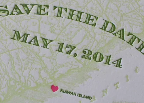
Here's a close up which shows the detail and impression:
This is a great design for a Save the Date and we can customize the map to suit the location of any wedding.
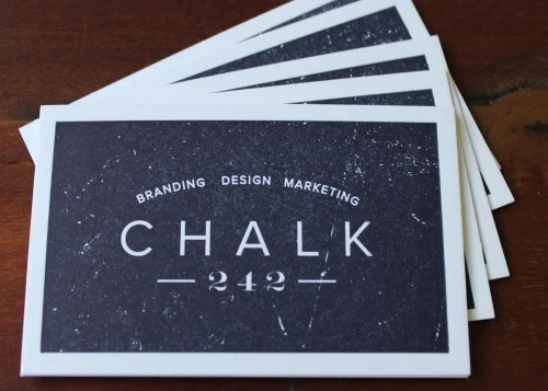
We were asked to print business cards for Chalk 242. They are a branding, design and marketing agency based in New York and we loved the look of their own branding. It was a very satisfying challenge for us to replicate the weathered look of the dark blue on their business card. We had to ensure that the plate allowed for subtly different ink coverage in different parts.
We are proud of how we were able to capture the effect of a chalkboard! (And did we mention how much we love that deep-midnight indigo color?!)