Floral Wreath Wedding

March 6, 2015

black-white-floral-wreath-letterpress-wedding

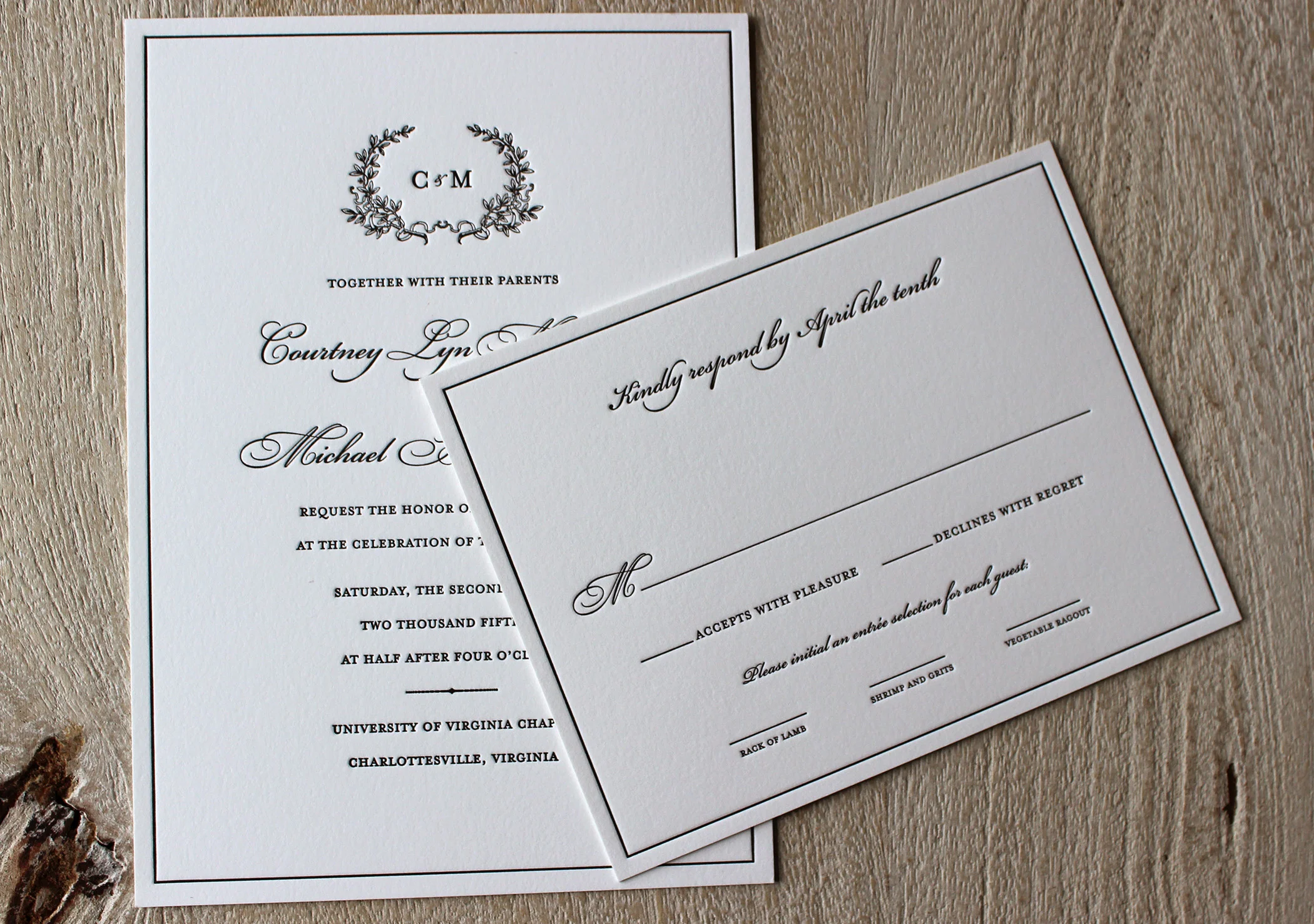
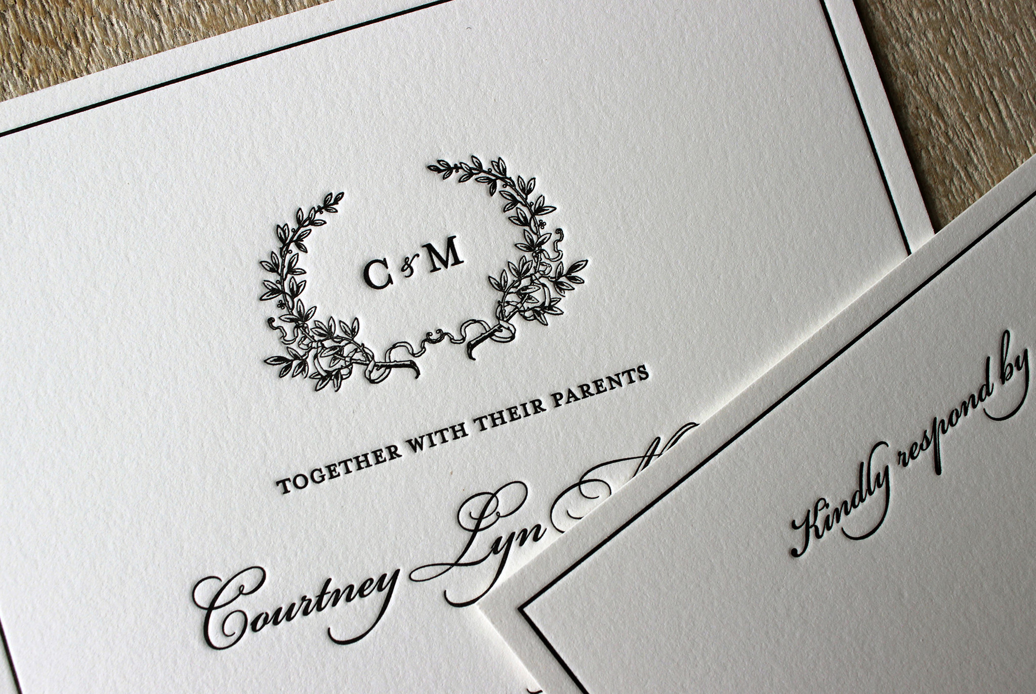
All of the designs in our Wedding Collection are meant to be customized to reflect a couple's style and the tone of their event. We love seeing how different these designs look for different couples. Here is one of our favorite versions of the Floral Wreath design.  Black letterpress printing always looks incredibly elegant.

black-white-floral-wreath-flower-letterpress-wedding

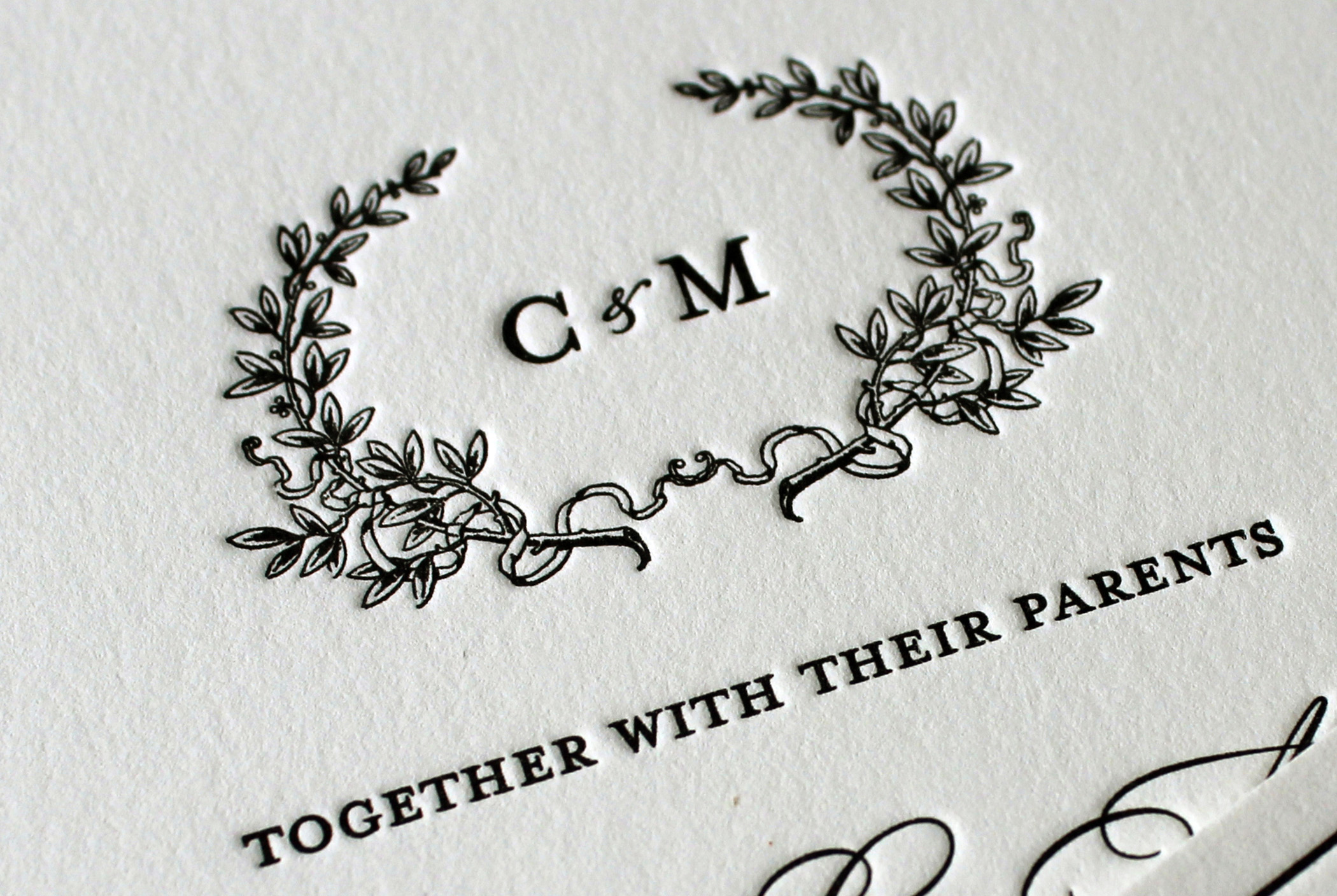
Their simple serif monogram fits perfectly inside the wreath of flowers.

black-white-floral-wreath-monogram-letterpress-wedding-invitations

This classic black and white wedding invitation really sets the tone for their elegant event. We hope their big day is a beautiful affair for everyone there!

Rustic Winter Wedding

January 17, 2015

gray-antlers-rustic-winter-wedding-invitation-lancaster-sesame-letterpress

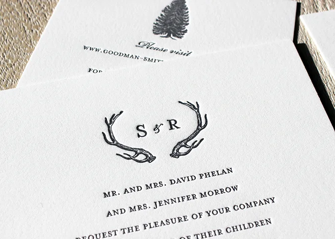
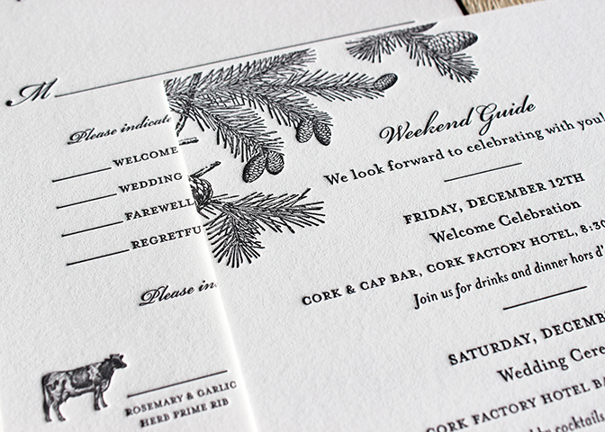
This invitation suite is one of our favorite styles as it incorporates a rustic theme with an elegant design, befitting a wedding. All the pieces are printed in a charcoal gray which gives the set a formal appearance.

The pine cones on the information card accentuated the rural nature of their winter wedding. The bride and groom wanted their wedding suite to reflect their bucolic venue. The Cork Factory Hotel is in historic downtown Lancaster, PA in a building that once housed a cork and glass company.

gray-pinecones-forest-rustic-winter-lancaster-wedding-itinerary-rsvp-sesame-letterpress

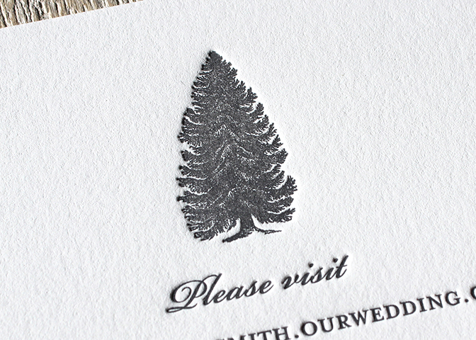
We can just imagine relaxing cozily by a fire, in between the ceremony and the reception, with a hot toddy in hand. What a wonderful way to spend a December weekend!
gray-pine-tree-rustic-winter-wedding-info-sesame-letterpress

Seeing green: A winter California wedding

January 14, 2015

gold-green-letterpress-save-the-date-bookmark-sesame

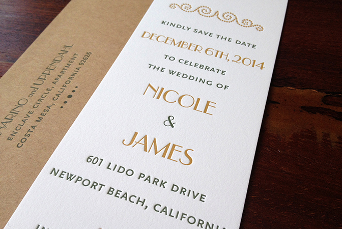
This fall we designed and printed a beautiful set of art nouveau inspired wedding invitations for a couple in southern California. They started things off sweet with a bookmark sized Save the Date, printed in a warm gold and green combination.

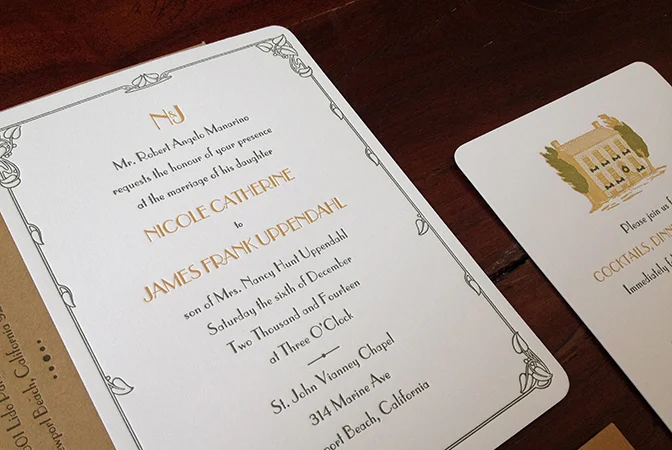
The invitation features a delicate border of dark green vines that accent the fine lines in the type. A wreath-decorated home was the perfect image for their intimate reception.

gold-green-art-nouveau-california-wedding-sesame-letterpress

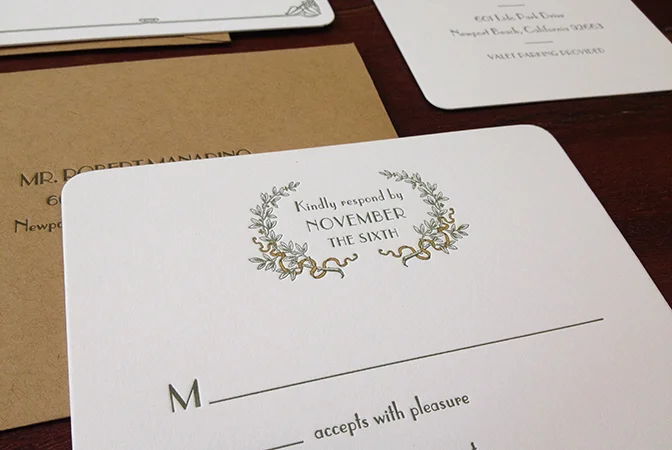
The gold ribbon woven through the wreath is a sweet, little detail that makes this response card stand out. The simplicity of this letterpress wedding suite is what makes it such a nice sight. It's all in the details!

gold-green-wreath-rsvp-california-wedding-sesame-letterpress

Feeling Blue: Ikat Wedding Invitation

January 5, 2015

navy-blue-ikat-dot-letterpress-wedding-invitation-sesame

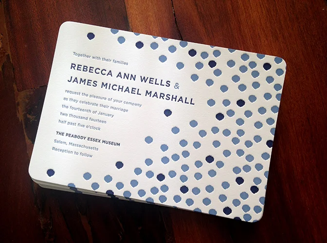
We recently remixed one of our tried and true, and a little blue wedding invitation designs. Ikat patterns are very popular, and we know why! This soft blue dot pattern is sweet and modern, perfect for a casual wedding. We can just imagine being at an intimate summer wedding by the sea.

We made a short video, documenting the process of printing this 2-color wedding invite. A word of warning; the sounds of the press clicking and clacking are slightly hypnotic and may cause drowsiness.

https://vimeo.com/112433613

Charming Navy Invitation Set

August 25, 2014

One of the really wonderful aspects of running a letterpress printing studio is the variety of requests we receive. One hour, we might get an email from someone asking us to incorporate a silhouette of their favorite pet into a greeting card and then next hour we will hear from someone who wants a really traditional design. We relish all of these challenges! Here's an example of a design that is both classic and extremely charming.

navy-letterpress-wedding-invitation

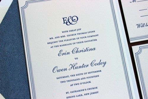
The invitation is further elevated with that beautiful dotted envelope liner. We love how this picks out the dots used alongside the solid line border.

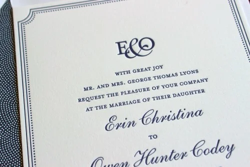
A custom monogram adds to the elegance of the design.

navy-letterpress-wedding-invite

Matte gold and elegant black invitations

August 7, 2014

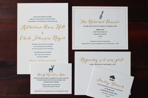
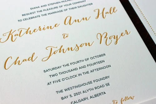
Make yourself comfortable because this blog post is going to feature quite a bumper haul of gorgeous photos. We loved designing this set of wedding stationery because it features unexpected and somewhat whimsical fonts with really classic, beautiful color choices. The result is a simply beautiful selection of letterpress printed pieces...

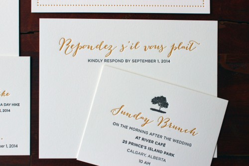
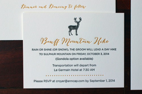
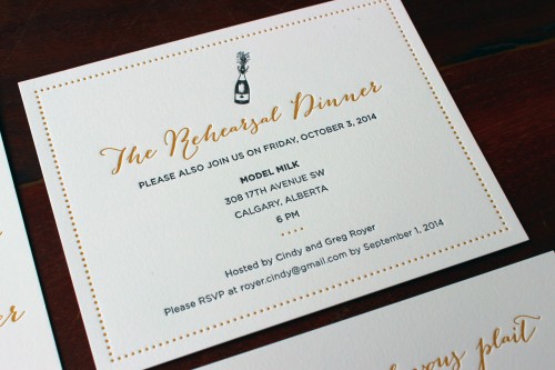
To add some extra visual interest, each card has a slightly different feel: the invitation is pared back and simple, the rehearsal dinner invitation features a dotted border and a selection of the other cards have motifs that are relevant to the location and atmosphere of each event. Scroll through the rest of the photos for more details!

gold-black-script-calgary-letterpress-wedding-invite-suite

gold-bombshell-script-letterpress-wedding-invite

gold-bombshell-script-letterpress-wedding-rsvp

gold-bombshell-script-banff-mountain-deer-letterpress-wedding

gold-script-bombshell-letterpress-wedding-rehearsal-champagne-calgary

Ladybug Wedding invitation set

July 27, 2014

red-ladybug-letterpress-custom-wedding-invitation-italian-sesame

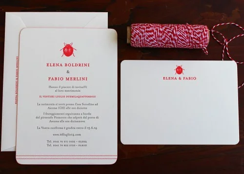
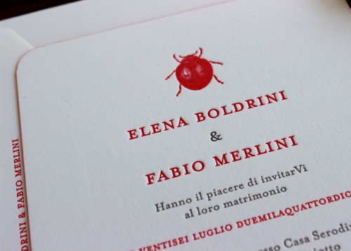
We printed this set for an Italian couple and we adore the unusual motif of a little ladybug. We are big fans of unexpected designs and layouts.

The crisp red ink is beautifully vibrant against a neutral gray and the non-cursive fonts work so well with the whole layout.

cute-red-ladybug-letterpress-wedding-invitation-italy-sesame

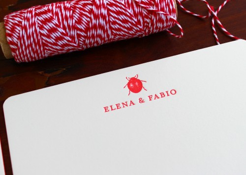
Elena and Fabio also asked us to print some personal stationery for them. We repeated the ladybug illustration to add an element of continuity. The couple can use these as thank you notes for wedding gifts and then as cards throughout their marriage.

red-ladybug-letterpress-custom-wedding-thank-notes-italy-sesame

Classic matte gold invitation set

July 14, 2014

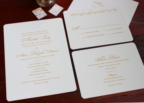
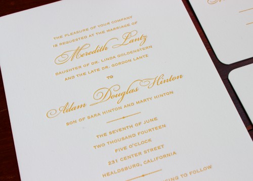
We worked with Meredith and Adam on their Save the Date cards and we were excited to collaborate on the designs for their invitations too. They went for a really classy, understated layout that highlighted the letterpress impression and the gorgeous ink color they chose.

They thought about incorporating an illustration at the top of each card but as with so many things, sometimes less is more. In the case of this set, we think it really benefits from the simplicity of the layout.

elegant-gold-bickham-script-letterpress-wedding-invite

timeless-gold-bickham-script-letterpress-wedding-invitation