Shadow-design Wedding Invitation
June 17, 2013

Show your dad how awesome you think he is with this card. It's almost like giving him a medal for services to fatherhood! We love the bright red and blue motif and the fun design.
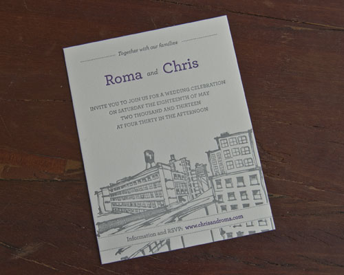
We wanted to share some images of this really pretty invitation we printed for Chris and Roma. You may recall that a few months ago we printed business cards for Roma. We were lucky enough to also be asked to print their wedding invitations. Phew - they were pretty busy planning a wedding and a new business venture!A friend of theirs had done a wonderful illustration of some Brooklyn buildings and rooftops and Chris had incorporated this into his invitation design. Together with the couple, we decided to go for a small card rather than the standard 5" x 7" and I think the results were perfect:


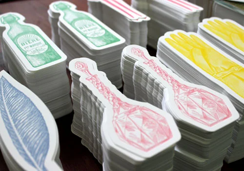
Because we spend our days working on machinery from the 1880's we're a little romantic about real books with beautiful covers and crisp paper pages. In honor of the old fashioned book, we've created a line of letterpress printed bookmarks. We have seven designs, all inspired by belongings one might find on a bedside table (along with a good book). We're particularly liking the perfume bottle and the mysterious glove...


Just a few weeks to go until Mother's Day and we have designed a really lovely card for the occasion! We love this bouquet and we think it looks particularly pretty printed in bright sunshine yellow and pink.
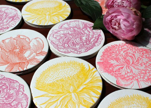
And here's a detail of the floral imagery:


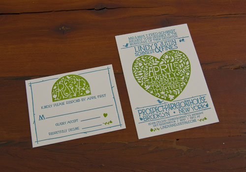
As well as designing our own range of wedding invitations, we also really enjoy working with artists to help print their own designs. A little while ago, we heard from designer, Justin Fines. He had created a beautiful design for invitations for his upcoming wedding and he asked us to print them. We took a look and immediately swooned over his arts and crafts style invitation and RSVP. His designs were just right for the location of his wedding; The Prospect Park Boathouse!
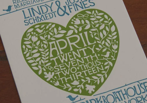
Here's a close up to show the intricacy of the design. All of the detail was perfect for letterpress:


We've been designing a few new additions to our product lines. We created a series of gorgeous floral coasters that are perfect for Spring...or Mother's Day...or wedding favors...or just a lovely bright pop of color on your dining table!
And we are thrilled to have already received quite a lot of press for these items. Including a feature on the Martha Stewart Weddings website!

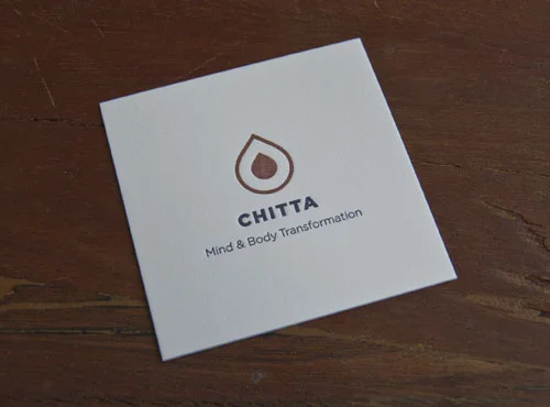
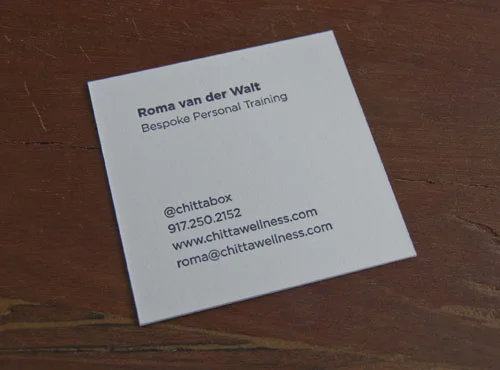
We've been enjoying printing some square-format business cards lately. A little while ago, we worked on some amazing fluorescent pink square cards for David Ceraso and we've just finished printing business cards for a newer client, Roma. She is starting a holistic personal training business and we worked from her own designs. When she came in to meet with us and discuss what kind of card stock she wanted, she saw a sample of a square card and immediately fell for it!

Good luck with the new business, Roma!
