Tangerine ink and blind embossing

June 17, 2014

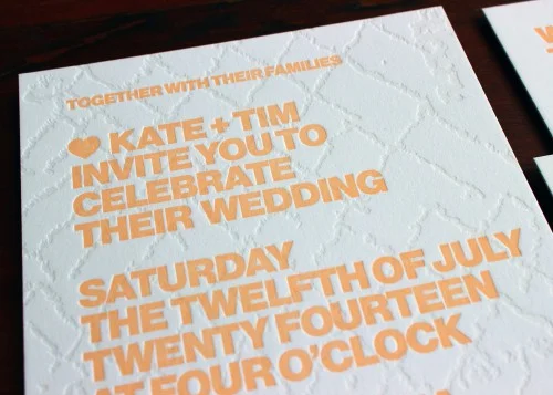
We have been printing loads of wedding invitations from designer-supplied files lately. We love seeing all the different styles and ideas that graphic designers come up with. It's wonderful to work closely with other artists and craftspeople to collaborate on their designs.Here's a recent invitation we printed:

blind-texture-tangerine-orange-modern-letterpress-wedding-invitation

The design features a blind-embossed background pattern overlaid with bold, chunky text in a gorgeous pale apricot color. We love how tactile this card is and how it plays with traditional notions of wedding invitations.

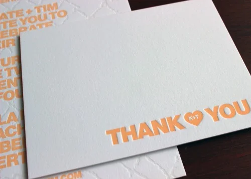
The design is by the very talented Tim Geesman and his Thank You card layout is no less awesome.

heart-tangerine-orange-modern-letterpress-wedding-thanks-notecard

Again, the design is really clever: we love the subtle customization of the initials in the heart. Thanks Tim and Kate for working with us on your printing!

Bespoke envelope lining

June 9, 2014

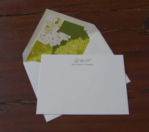
Most of our printing is custom: our clients love having personalized items with their name/monogram or other individual details included. And for an additional bespoke element, how about choosing your own paper to line envelopes? You can go for something simple in a single color or choose a really unique fine paper with a pattern or design.We love how the ink color used on this thank you card is picked up in the verdant lining paper used for the envelopes:

green-floral-envelope-lining-letterpress-stationery

Brooklyn Greeting Cards

June 6, 2014

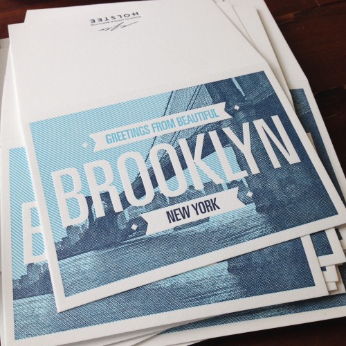
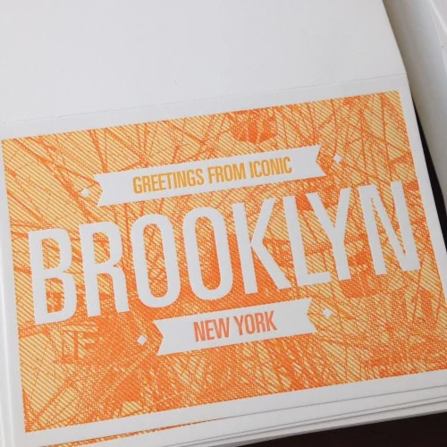
holstee-brooklyn-new-york-nyc-skyline-letterpress-greeting-card

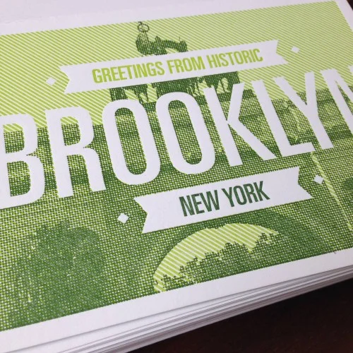
Holstee is a lovely company that specializes in designing unique and beautiful products. They contacted us with a series of graphic greeting cards, each of which feature an iconic Brooklyn landmark. So - with our love of this borough we call home - we were thrilled to work on printing these items.

holstee-orange-iconic-brooklyn-nyc-letterpress-card

holstee-historic-brooklyn-nyc-green-letterpress-card

Can you recognize the three architectural designs? Don't you love those saturated colors. We always enjoy working with designers to render their ideas in letterpress: contact us if you have something you would like us to print for you!

Blind embossed palm trees

June 4, 2014

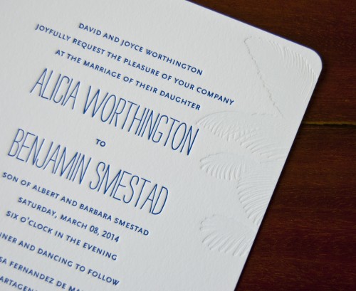
palm-tree-tropical-destination-wedding-letterpress-invitation

Just a quick blog post with a close-up of a gorgeous invitation. We really like how this design is both elegant and informal. The Strangelove font used for the couples' names keeps it from looking too stuffy and the blind embossed palm tree motif adds another subtly, tactile layer to the letterpress technique!

White on white business card

May 29, 2014

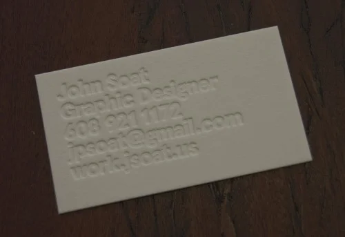
white-letterpress-business-card-graphic-designer

Sometimes a really simple business card design is so effective. We printed this blind embossed card for a graphic designer and we love how the tactile nature of that deep impression makes any color unnecessary! It's a strong, bold layout and we think it looks great!

Hand illustrated social stationery

May 19, 2014

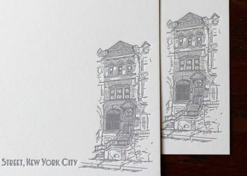
Sometimes clients ask us to include an illustration that they provide on their printed materials. As long as the design is suitable for letterpress, we are happy to do this. It's always great for us to see the work of other artists and craftspeople.We printed these pretty notecards which feature a hand drawn illustration of the client's home. These look really smart in cool gray ink and they're extremely personal and bespoke.

nyc-new-york-brownstone-illustration-letterpress-custom-stationery

Matte Gold Wedding Suite

May 17, 2014

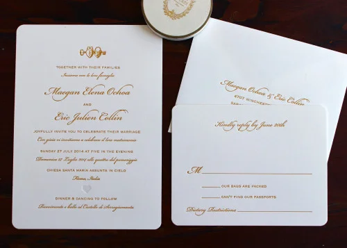
We just finished printing this wedding set for a lovely couple who are getting married in Italy. We're jealous: all that wonderful food, gorgeous views and la dolce vita!They decided to have the set printed in our matte gold ink: we love how this hue is the perfect blend of elegant and understated.

italian-gold-heart-locket-script-letterpress-wedding-invitation

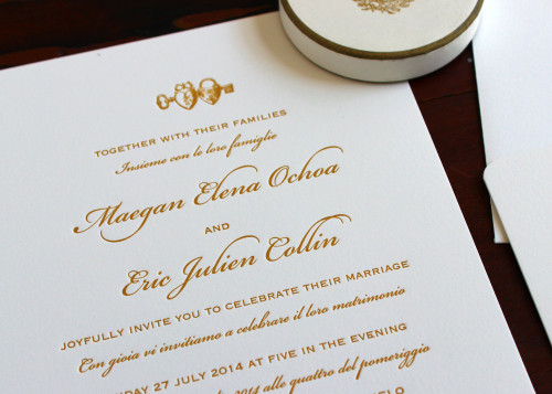
They selected a few of illustrations from our image library to give an extra level of customization to their invitation:

italian-english-gold-heart-script-letterpress-wedding-invite

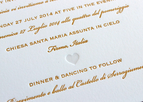
We love the little heart lockets and we also really like how the simple heart silhouette looks as a blind-embossed pressed image:

bilingual-italian-gold-heart-letterpress-wedding-invitation

Without ink, it just highlights the quality of the impression.

Congratulations Maegan and Eric!

Yellow Summer Bouquet

May 15, 2014

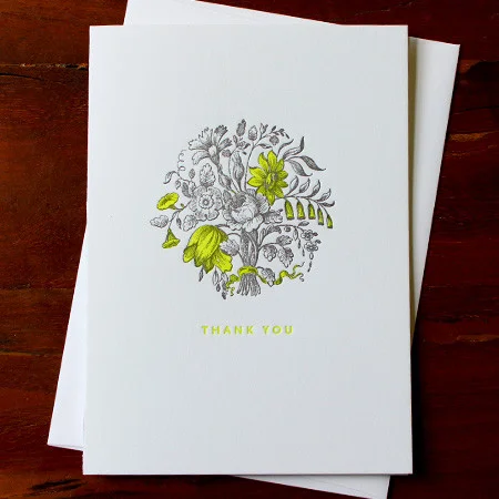
neon-yellow-bouquet-thank-you-letterpress-card-sesame

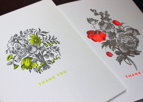
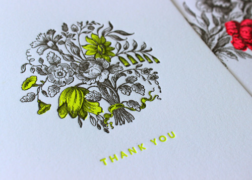
We just finished a new design for our line of greeting cards. Our various floral layouts are always very popular so we worked on a version with a pretty arrangement and a really contemporary mix of dark, neutral ink and bright, fluorescent yellow.

We love how this card straddles the vintage theme with 21st century colors!

Here are some photos that show the new design alongside one of our other VERY bright layouts:

neon-yellow-red-bouquet-floral-thanks-letterpress-card-sesame

neon-yellow-floral-bouquet-thank-you-letterpress-card-sesame