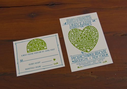
As well as designing our own range of wedding invitations, we also really enjoy working with artists to help print their own designs. A little while ago, we heard from designer, Justin Fines. He had created a beautiful design for invitations for his upcoming wedding and he asked us to print them. We took a look and immediately swooned over his arts and crafts style invitation and RSVP. His designs were just right for the location of his wedding; The Prospect Park Boathouse!
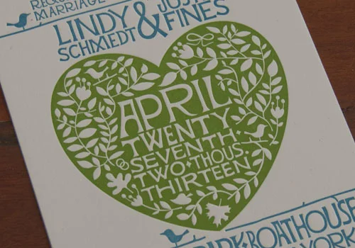
Here's a close up to show the intricacy of the design. All of the detail was perfect for letterpress:
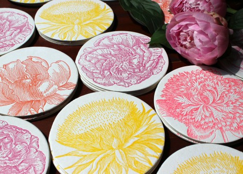
We've been designing a few new additions to our product lines. We created a series of gorgeous floral coasters that are perfect for Spring...or Mother's Day...or wedding favors...or just a lovely bright pop of color on your dining table!
And we are thrilled to have already received quite a lot of press for these items. Including a feature on the Martha Stewart Weddings website!
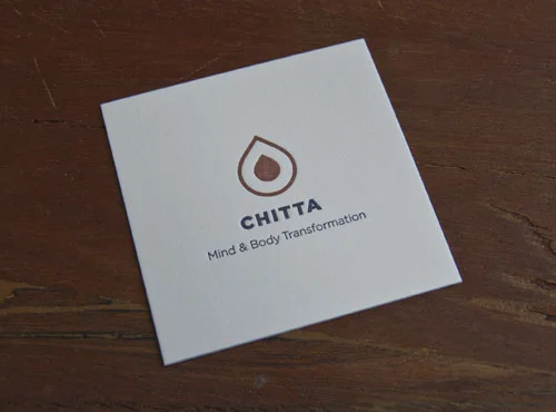
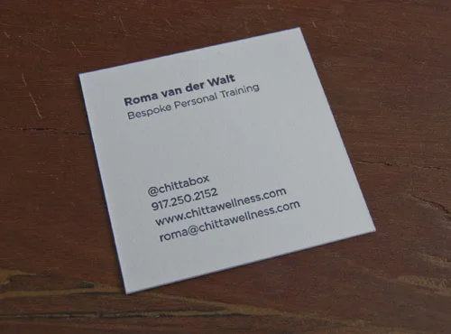
We've been enjoying printing some square-format business cards lately. A little while ago, we worked on some amazing fluorescent pink square cards for David Ceraso and we've just finished printing business cards for a newer client, Roma. She is starting a holistic personal training business and we worked from her own designs. When she came in to meet with us and discuss what kind of card stock she wanted, she saw a sample of a square card and immediately fell for it!
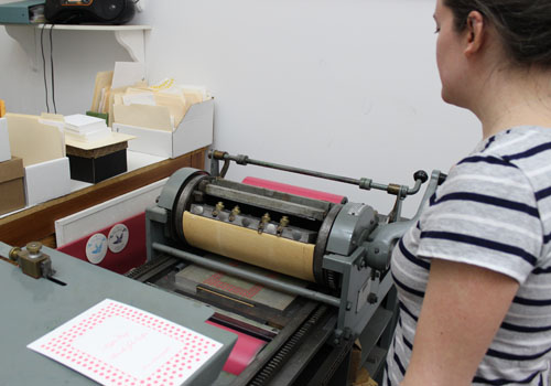
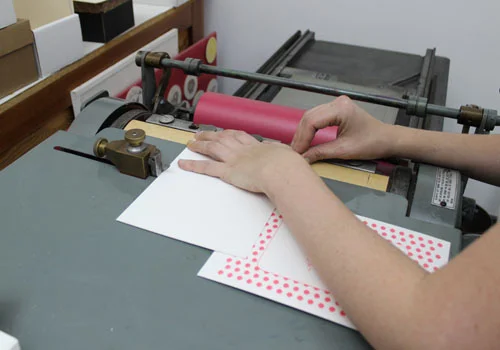
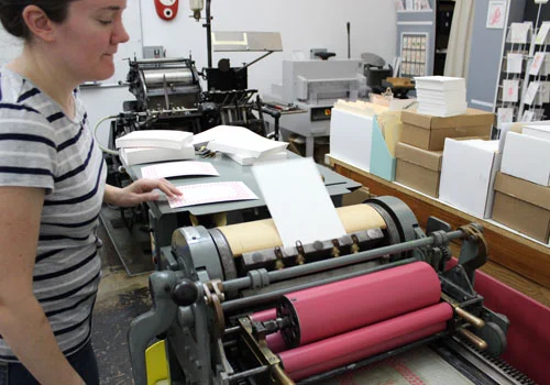
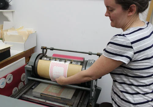
At Sesame, we really love printing jobs for our friends and family. And I'm so excited at the moment that we are printing invitations for my wedding! It was so much fun designing these with my colleagues here at the press and there is something very special about having them printed by a friend.After the success of our post about printing on the Vandercook, I thought this was the perfect opportunity to provide a step-by-step guide to printing on our reliable workhorse: the Golding Jobber. So Kate and I took a bunch of photos of the process involved in printing one of my wedding invitation items...
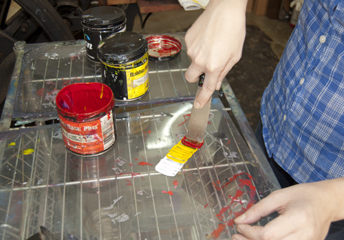
First of all, we measured out the colors that would blend to form the Pantone shade I wanted:
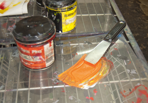
I'm always so amazed at the way that we can accurately mix a precise color:
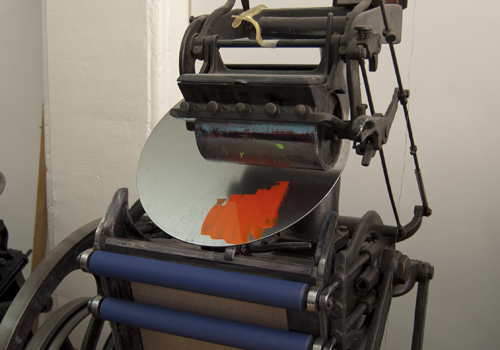
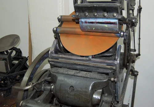
The color always looks much more vivid before it has been applied to the press. This is because there is a large amount of ink blended initially. Kate applies just a tiny amount to the press disc:
The ink still looks quite bright at this time. But by the time the press has dispersed the ink all over the disc, it is clear that the color is slightly more muted:
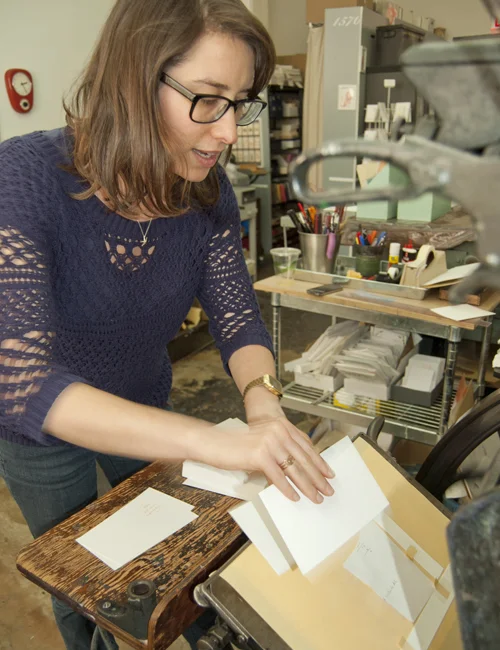
Once the press is evenly inked, it's time to start feeding in the cards, one by one. Here I am (concentrating extremely hard) as I line up a card to be printed:
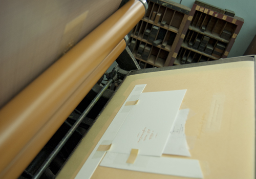
And just after the rollers have printed the card, here's how it looks inside the guides:
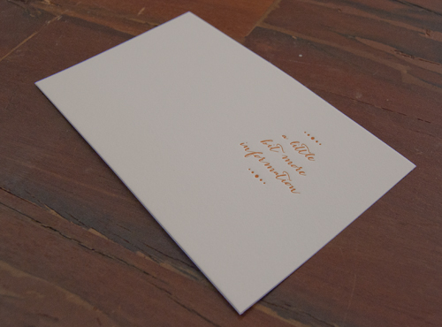
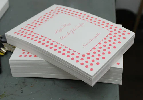
105 cards later, we had a lovely pile of finished printing. Here's a sample:
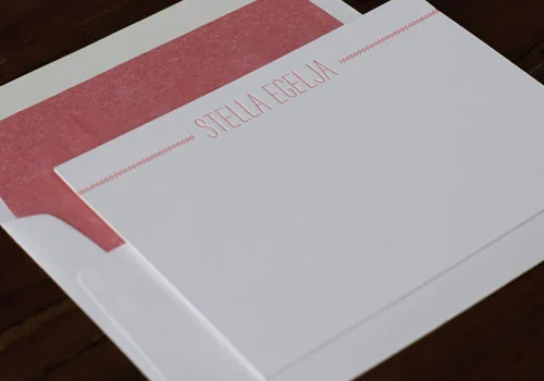
We've been experimenting with a few new fonts lately. We love discovering typefaces that are a little unusual and creative. Here are some photos of one of our most recent notecard designs. It plays around with a really unique caps font called 'strangelove' (we adore the name nearly as much as the font!). It just needed the candy stripes on either side to make this a lovely, whimsical notecard.
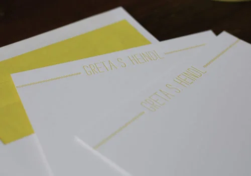
And here it is in bright yellow:
The lined envelopes just add the final, perfect burst of color for these cards!
Today Kate has been printing the first color of a wedding invitation on our Vandercook printer. I'm more used to seeing her printing on the Golding Jobber so I was very curious to check out how the Vandercook works!So, for any other letterpress enthusiasts out there, here's a little photographic step-by-step guide to how to print on the Vandercook.
First of all, ink is applied to one of the rollers:
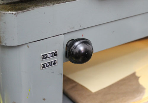
Then Kate ensures that the machine is in "trip" mode. This means that she can ink the rollers without actually printing onto the cardstock.
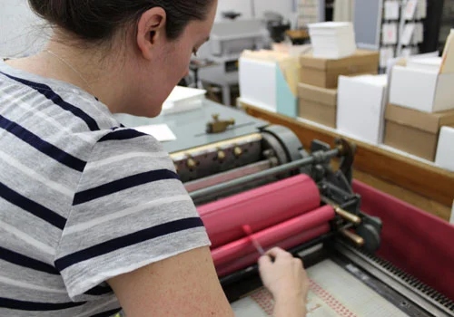
Then she turns the crank so that the rollers are evenly coated with ink:
The rollers are returned to their original position and Kate then switches the machine to "print" mode. This enables the rollers to actually press into the cardstock and transfer the ink and the impression.
The next step is to carefully place the blank cardstock in the correct place. There are a row of "grippers" which hold the card and also a guide which lines up the card so it is perfectly aligned:
Then it's simply a case of turning the crank! As long as everything is correctly set up, the grippers on top of the rollers will scoop up the card:
And then the process will continue by rolling the card under the rollers, against the inked plate, leaving behind the inked impression. Then Kate just has to pull the printed item out of the grippers:
And - voila - a finished piece (well, the first color anyway!). It really is amazing to see how many little movements and skilled elements are involved in printing just one color of one piece. It really reminded me of the craftmanship of letterpress printing and the care and attention that goes into the process!
Here's a pile of the invitations ready to have their second color applied:
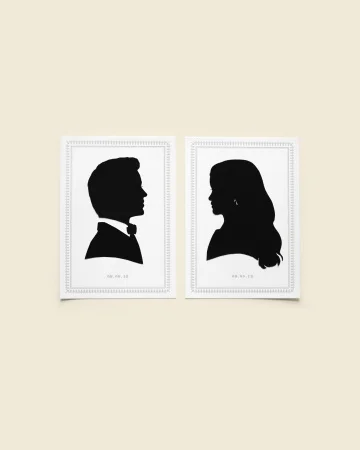
Sometimes we are asked to do some printing for clients who have quite a high profile. We never get too star-struck but at the same time, it's lovely to see our designs and printing featured online and in print.We recently bought ourselves a copy of Martha Stewart Weddings so we could take a look through their coverage of the wedding of Blake Lively and Ryan Reynolds. We printed the letterpress borders which surrounded their silhouettes on the opening page of the article.
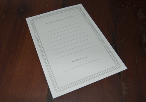
We also printed cards for guests to fill in with messages for the happy couple!