Brand new Valentine

January 30, 2013

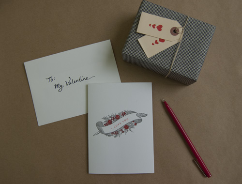
We have added a new notecard to our range. It is great for Valentine's Day but as with so many of our items, you can really send it at any time of the year.I've also been experimenting with 'styling' our photos a little more - cue calligraphy, props and artful arrangements! I think it does help to show how lovely our products are: what do you think?

Valetines - kraft background

We're also getting ready to run a workshop with Etsy: print your own Valentines! We've designed a bunch of really cute little cards and participants will have the opportunity to print a sheet of these and then cut them out and color them in themselves. Stay tuned for photos and a round up of the event!

- Jana

Our color range

January 28, 2013

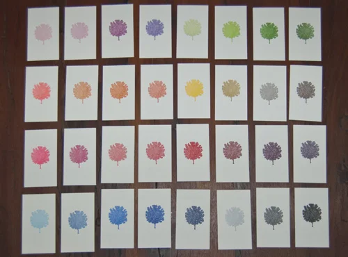
When we work with clients to design and print their stationery, we are always careful to ensure that there is clarity around our colors. Sometimes, we'll get an e-mail from a client who asks us to match an online color. This is really difficult: different computer monitors have a massive impact on how the colors look. We much prefer to be sent an actual, tangible color swatch. That way, we can match the exact Pantone color.With this in mind, we've also been working on printing color swatches:

colored trees

We love how these mini-tree prints look when they are all arranged together. We've been handing them to our clients so that they can flick through, get a sense of how the color looks when it has been printed and also place colors together to see what complements what!

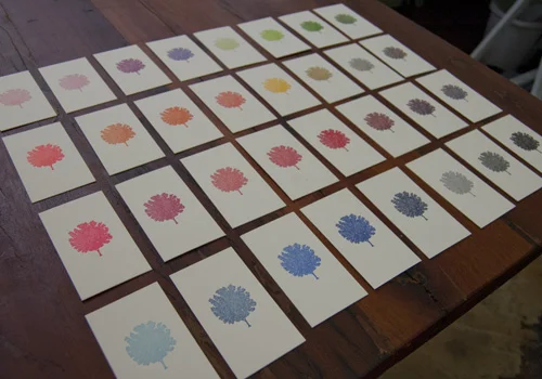
Here's another shot from a different angle:

colored trees 2

Which is your favorite?

- Jana

A really BIG job!

January 23, 2013

Usually, for the first six months of the year, we are mainly focused on printing wedding invitations. We call it our 'wedding season'. But this week, we have a huge corporate job that we are working on for a great client. Kate is non-stop: she has already trimmed 5000 cards to the correct size and now - as I write this - she has started the process of printing them one by one! Phew! To give you a sense of the volume of paper, here's a photo of just some of the piles:

piles of paper!


All about RSVPs

January 22, 2013

When it comes to the RSVP for your wedding stationery, there are plenty of options. We are going to address these through a series of posts.First of all, the most simple option is to use a blank card which just requests that your guests respond by a certain date. This is a lovely way to encourage people to write you a personal message.

RSVP - blank

We love the color choice on the invitation above and the way in which the text is a little slanted and seems to run off the card slightly.

However, this style relies on the idea that your event is completely self-explanatory and all you need to know is who is coming. If you are having a few different events, or if you need to know menu choices in advance, you'll probably need a more in-depth RSVP.

Spectacle Notecards

January 20, 2013

Often when clients discuss their personalized stationery with us, we try to encourage them to include a motif or image that represents them. Sometimes this will be something related to their job (a pen and inkpot for a writer or a hammer and nails for someone who works in construction or woodwork). Or, it might be something more related to their hobbies (a camera for someone interested in photography perhaps).We love these notecards because the client has chosen an image which literally captures one of his defining accessories: a pair of bold glasses! Teamed with a bright lined envelopes these are just super.

Spectacle motif notecard

- Jana

Floral Business Card

January 19, 2013

nicolette cards

We have printed business cards a few times for Nicolette Owen owner of Nicolette Camille. She is a floral designer and she designed this card to reflect the scope of her business.

It looks so pretty in letterpress with all the fine detail picked out.

nicolette close up

Check out Nicolette's beautiful creations on her blog too. Card designed by Linda Aldredge, the creative force behind LuLu Organics.

- Jana

Mixing ink for our presses

January 17, 2013

We've been trying to document some of the basic activities that are part of each and every printing job we do. We've shown you how we oil the presses. This time we wanted to demonstrate how we mix inks to exactly match color choices. It's a process that melds science and instinct! Take a look:http://www.youtube.com/watch?v=VIg_uOiiIpo

"Modern" New Year Card

January 17, 2013

Modern New Year Card

We recently printed a really interesting New Year Card for New York restaurant, The Modern. It's housed in the Museum of Modern Art in the city so we knew that the design would be something creative and unusual.

It was art directed and designed by Faith McCormick. We love the blind embossing that covers the whole card. We also really like the alignment of the main message. A card that really highlights the tactile nature of letterpress! Here's a close up of the blind embossing:

Modern New year Card - close up

- Jana