A very exciting printing job!

April 1, 2013

At Sesame, we really love printing jobs for our friends and family. And I'm so excited at the moment that we are printing invitations for my wedding! It was so much fun designing these with my colleagues here at the press and there is something very special about having them printed by a friend.After the success of our post about printing on the Vandercook, I thought this was the perfect opportunity to provide a step-by-step guide to printing on our reliable workhorse: the Golding Jobber. So Kate and I took a bunch of photos of the process involved in printing one of my wedding invitation items...

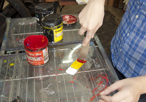
First of all, we measured out the colors that would blend to form the Pantone shade I wanted:

Jana invite 4

I'm always so amazed at the way that we can accurately mix a precise color:

Jana invite 5

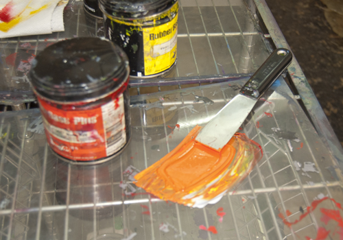
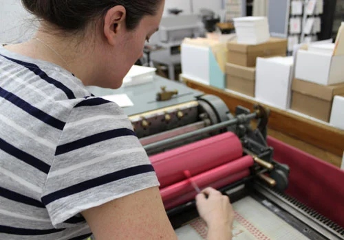
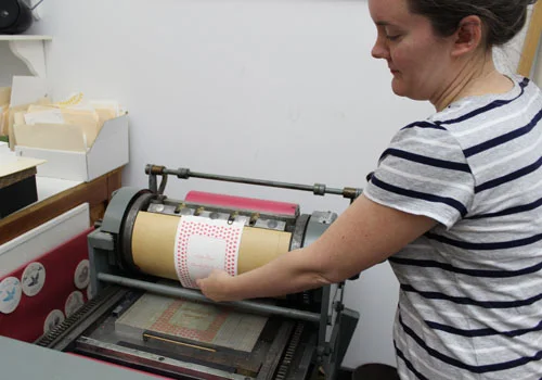
The color always looks much more vivid before it has been applied to the press. This is because there is a large amount of ink blended initially. Kate applies just a tiny amount to the press disc:

Jana invite 6

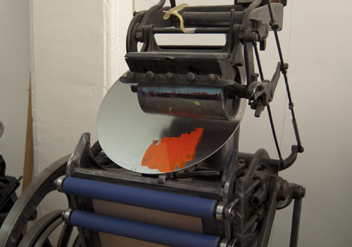
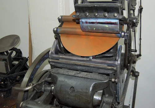
The ink still looks quite bright at this time. But by the time the press has dispersed the ink all over the disc, it is clear that the color is slightly more muted:

Jana invite 7

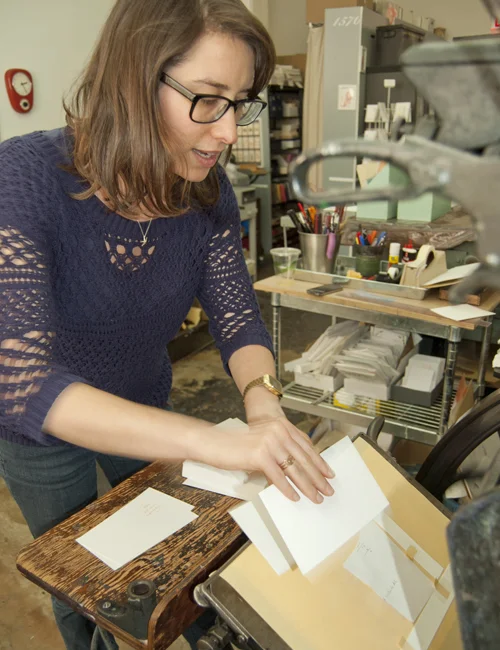
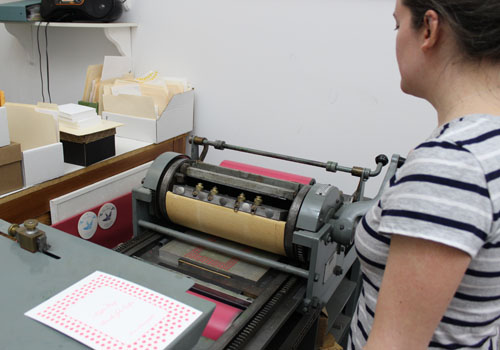
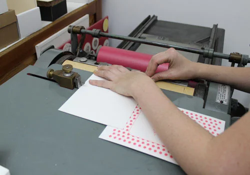
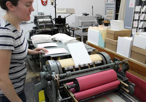
Once the press is evenly inked, it's time to start feeding in the cards, one by one. Here I am (concentrating extremely hard) as I line up a card to be printed:

Jana invite 8

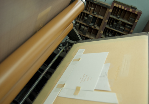
And just after the rollers have printed the card, here's how it looks inside the guides:

Jana invite 9

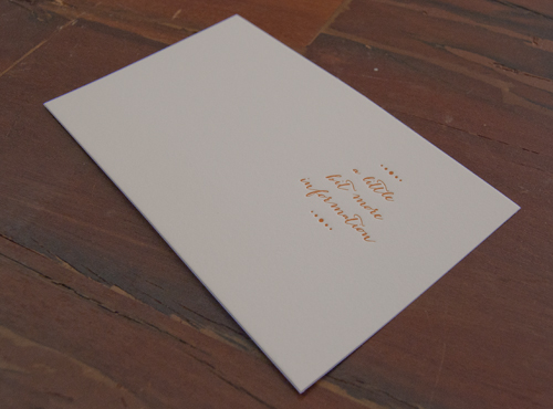
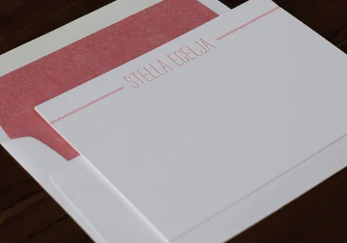
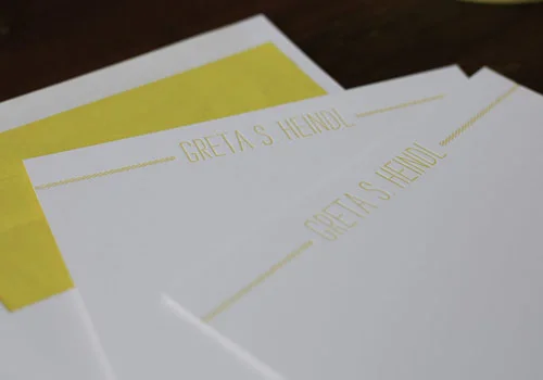
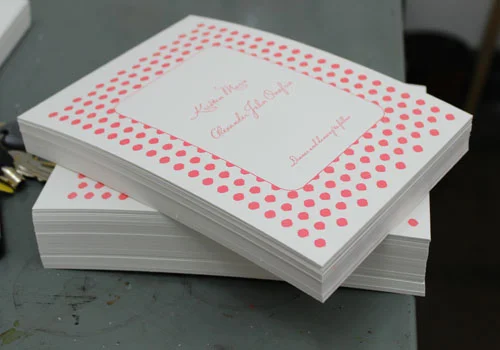
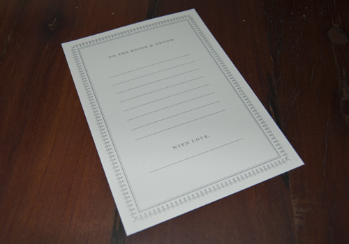
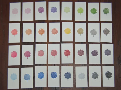
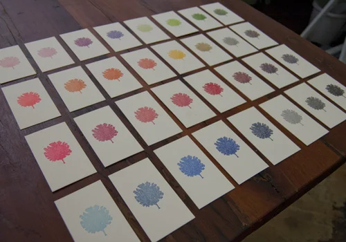
105 cards later, we had a lovely pile of finished printing. Here's a sample:

Jana invite 10

- Jana

Newest notecard designs

March 27, 2013

candy stripe a

We've been experimenting with a few new fonts lately. We love discovering typefaces that are a little unusual and creative. Here are some photos of one of our most recent notecard designs. It plays around with a really unique caps font called 'strangelove' (we adore the name nearly as much as the font!). It just needed the candy stripes on either side to make this a lovely, whimsical notecard.

And here it is in bright yellow:

candy stripe b

The lined envelopes just add the final, perfect burst of color for these cards!

- Jana

Printing on the Vandercook

March 21, 2013

Today Kate has been printing the first color of a wedding invitation on our Vandercook printer. I'm more used to seeing her printing on the Golding Jobber so I was very curious to check out how the Vandercook works!So, for any other letterpress enthusiasts out there, here's a little photographic step-by-step guide to how to print on the Vandercook.

First of all, ink is applied to one of the rollers:

vandercook 1

Then Kate ensures that the machine is in "trip" mode. This means that she can ink the rollers without actually printing onto the cardstock.

vandercook 2

Then she turns the crank so that the rollers are evenly coated with ink:

vandercook 3

The rollers are returned to their original position and Kate then switches the machine to "print" mode. This enables the rollers to actually press into the cardstock and transfer the ink and the impression.

The next step is to carefully place the blank cardstock in the correct place. There are a row of "grippers" which hold the card and also a guide which lines up the card so it is perfectly aligned:

vandercook 4

Then it's simply a case of turning the crank! As long as everything is correctly set up, the grippers on top of the rollers will scoop up the card:

vandercook 4b

And then the process will continue by rolling the card under the rollers, against the inked plate, leaving behind the inked impression. Then Kate just has to pull the printed item out of the grippers:

vandercook 5

And - voila - a finished piece (well, the first color anyway!). It really is amazing to see how many little movements and skilled elements are involved in printing just one color of one piece. It really reminded me of the craftmanship of letterpress printing and the care and attention that goes into the process!

Here's a pile of the invitations ready to have their second color applied:

vandercook 6

- Jana

A little bit of celebrity!

January 31, 2013

Sometimes we are asked to do some printing for clients who have quite a high profile. We never get too star-struck but at the same time, it's lovely to see our designs and printing featured online and in print.We recently bought ourselves a copy of Martha Stewart Weddings so we could take a look through their coverage of the wedding of Blake Lively and Ryan Reynolds. We printed the letterpress borders which surrounded their silhouettes on the opening page of the article.

reynolds-lively-opener_vert

We also printed cards for guests to fill in with messages for the happy couple!

note to bride and groom

Brand new Valentine

January 30, 2013

We have added a new notecard to our range. It is great for Valentine's Day but as with so many of our items, you can really send it at any time of the year.I've also been experimenting with 'styling' our photos a little more - cue calligraphy, props and artful arrangements! I think it does help to show how lovely our products are: what do you think?

Valetines - kraft background

We're also getting ready to run a workshop with Etsy: print your own Valentines! We've designed a bunch of really cute little cards and participants will have the opportunity to print a sheet of these and then cut them out and color them in themselves. Stay tuned for photos and a round up of the event!

- Jana

Our color range

January 28, 2013

When we work with clients to design and print their stationery, we are always careful to ensure that there is clarity around our colors. Sometimes, we'll get an e-mail from a client who asks us to match an online color. This is really difficult: different computer monitors have a massive impact on how the colors look. We much prefer to be sent an actual, tangible color swatch. That way, we can match the exact Pantone color.With this in mind, we've also been working on printing color swatches:

colored trees

We love how these mini-tree prints look when they are all arranged together. We've been handing them to our clients so that they can flick through, get a sense of how the color looks when it has been printed and also place colors together to see what complements what!

Here's another shot from a different angle:

colored trees 2

Which is your favorite?

- Jana

A really BIG job!

January 23, 2013

Usually, for the first six months of the year, we are mainly focused on printing wedding invitations. We call it our 'wedding season'. But this week, we have a huge corporate job that we are working on for a great client. Kate is non-stop: she has already trimmed 5000 cards to the correct size and now - as I write this - she has started the process of printing them one by one! Phew! To give you a sense of the volume of paper, here's a photo of just some of the piles:

piles of paper!