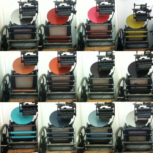
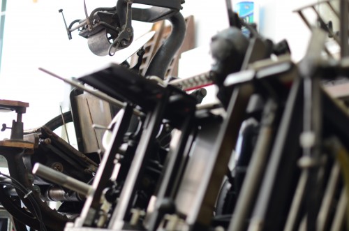
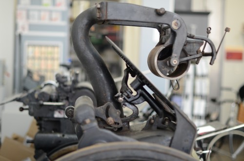
We are gearing up for the Dumbo Arts Festival and our presses have been working really hard! Today we printed in twelve different colors and each time, I took a photo of the press, inked up! A whole rainbow on our Golding Jobber Printing Press...
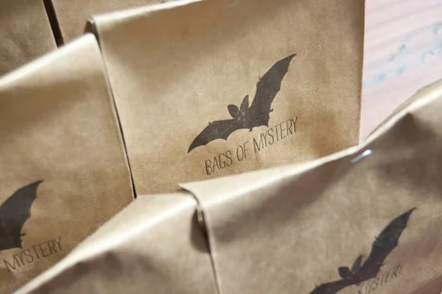
If you are in the Brooklyn/NYC area this coming weekend, September 29th and 30th, please stop by and visit us! We are participating in the annual DUMBO Arts Festival, which is an amazingly inspiring event. The neighborhood will be filled with art and music and cool surprises.We are at 55 Washington Street, suite 608, Brooklyn, NY 11201. We will be open on Saturday and Sunday from noon to 6pm and will be selling lots of letterpress goods, including our ever popular Bags of Mystery.
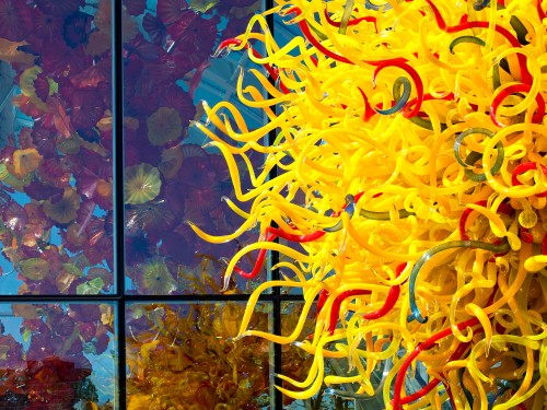
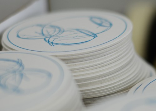
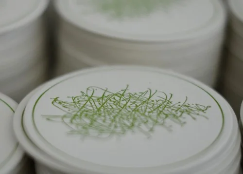
We love the gorgeous glass work of artist Dale Chihuly so we were thrilled to be given the opportunity to print coasters featuring Chihuly's drawings for the new Dale Chihuly Garden and Glass Museum at the Seattle Center.
Chihuly_Coasters_bl_300dpi
Chihuly_Coasters_gr_300dpi
We printed four designs and these are packed together and sold at the museum's shop as a set of 8 coasters. It is such a treat to be able to collaborate with artists we admire to create letterpress pieces. If I ever make it to Seattle, this will be my first stop!
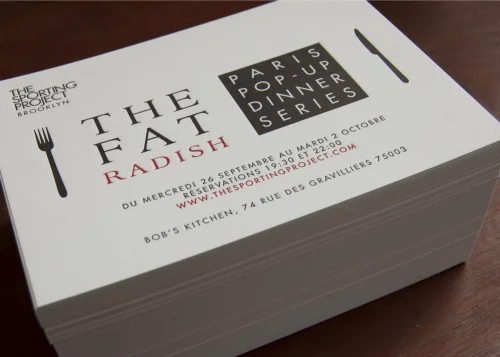
Over the last dozen years, we've been lucky to collaborate with really cool people involved in interesting projects. I love meeting other entrepreneurs and getting to learn about their creative ventures. We often work with people as they are launching their businesses and then get to collaborate over and over as their business grows and evolves. One of our favorite collaborations these days is with Jenny Capano and Tara Gilson of The Sporting Project, a new creative agency based in Paris. With roots in NYC and a love of Paris, they are bringing the two cities' lively cultures together through exclusive events, exhibitions and consultancy. This month they are hosting a "Pop-Up Dinner" and bringing New York's, The Fat Radish, to the Marais. We wish we could attend! For more information, check out the nice press they have gotten through Go Go Paris and check out the sweet letterpress invitation.
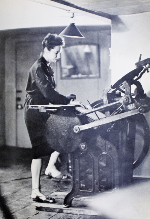
In 1942, Anaïs Nin moved a printing press into her studio at 144 Macdougal Street and taught herself how to set type and operate the machine. In Volume 3 of her diary, she describes her experience printing the limited edition of her book, Winter of Artifice, which was self published in 1942:
"The relationship to handcraft is a beautiful one. You are related bodily to a solid block of metal letters, to the weight of the trays, to the adroitness of spacing, to the tempo and temper of the machine. You acquire some of the weight and solidity of the metal, the strength and power of the machine. Each triumph is a conquest by the body, fingers, muscles. You live with your hands, in acts of physical deftness."
We love the perfect description of the satisfaction that comes from working with such an amazing machine. I wonder where her press is now...the laptop just can't compare.
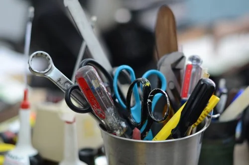
We had a really sweet journalism student, Alejandra Russi, visit us in the Spring as part of a video profile project she was working on for a class. Here is a link to the little video she shot at the studio: http://vimeo.com/41868638Alejandra took some beautiful photos of the studio too and sent them for us to share on our blog. It's cool to see what catches someone's eye when they come to the studio for the first time. I love the still life pictures of tools!
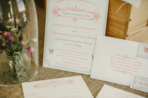
The beautiful Style Me Pretty website recently featured a wedding of one of our favorite clients. The bride has an amazing fox ring and wanted to incorporate some minimal fox imagery in the stationery. We customized our Broadside invitation to include a sweet little animal. Check out her gorgeous veil in the photos on the site!
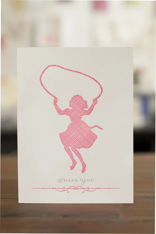
Our friends over at Felt and Wire just did a really nice post on silhouettes in graphic design. I love Roberto de Vicq’s book covers for author Chris Cleave and it was an honor to be included in the same post.


