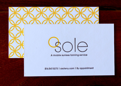
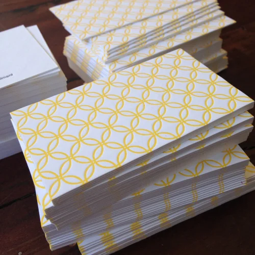
We just finished printing gorgeous business cards for a mobile sunless tanning service. The designer created a pretty sunshine-yellow pattern for the back of the card and a simple layout for the front.
We like how the single yellow circle looped over the business name is then repeated in the graphic on the reverse:
BC_Sole 2
This is such a charming card design: we love how the letterpress impression creates the feel of a textile in that repeating pattern.
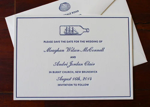
We are big fans of nautical and maritime imagery and it features on so many of our printed items. From our octopus coasters to our deluxe anchor notecard sets, we love finding ways to reference the sea in our work.So obviously, we adore working with couples to incorporate their vision of the coast into their printed stationery. We've recently worked with two lovely couples on their Save the Date cards.
Meaghan and Andre fell for our ship in a bottle illustration and it just looks so pretty at the top of their card:
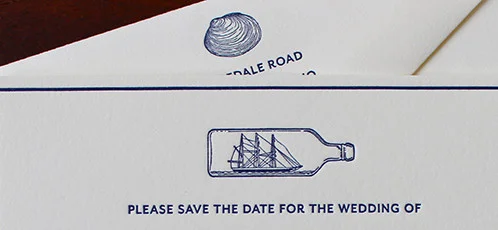
We're always happy to include a small motif above the return address on the envelope too. Continuing the seaside theme, Meaghan and Andre opted for a little clam shell:
We love how this Save the Date looks and we can't wait to share photos of their actual wedding invitations!
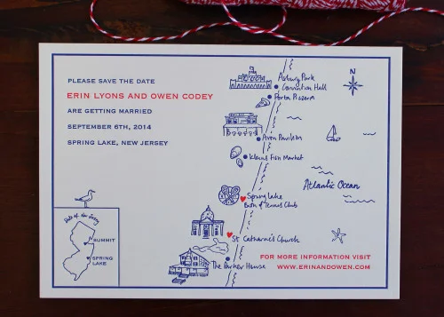
Erin and Owen also used a dark blue ink for their design (does anything signify the ocean more than a nice, rich, saturated blue?). But they decided to create a truly bespoke card with hand drawn illustrations and handwritten lettering. They also included pops of vivid red:
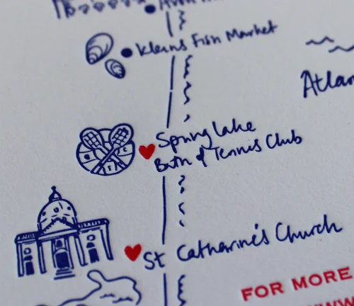
The little seagull perched on the map in the lower left corner just makes us feel so happy! Here's a close up of part of the map to show the intricacy of the illustrations and the letterpress impression:
We're so excited to hear all about both of these weddings!
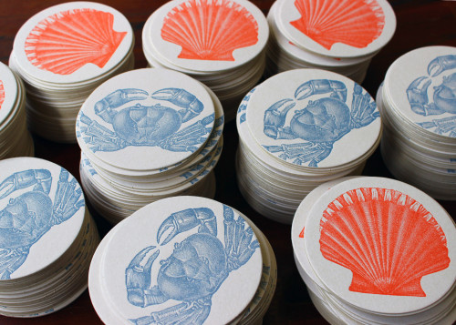
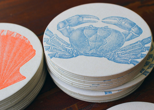
We've added a few new designs to our line of coasters. Both of these are inspired by memories of holidays by the beach and searching through the sand for shells and little crustaceans!
These would be perfect for a beach wedding or a BBQ beside the sea. They are also the perfect gift for hosts who live near the ocean. The coasters are beautifully packaged in individual sets of eight. You can choose the blue crab coasters or the coral scallop coasters. Or go ahead and treat yourself to both!
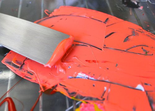
We chose colors that are bright and vibrant and reference the imagery. Here's a photo of us mixing and preparing the coral ink before applying it to the press:
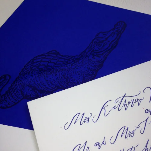
We posted a few months ago about a Save the Date that we printed for a Kiawah Island wedding. It featured the beautiful calligraphy of Betsy Dunlap.Well, here's a sneak peak at a part of the invitation design:
As you can see, there's more of that gorgeous calligraphy. We're most excited about the custom envelope liners that we printed! We love how guests will open the envelope flap and see the alligator printed onto that vibrant purple-y blue!
Custom envelope liners are a great way to make your invitation stand out. We can print a monogram, a pattern or the motif of your choice.
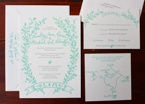
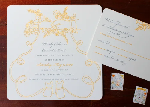
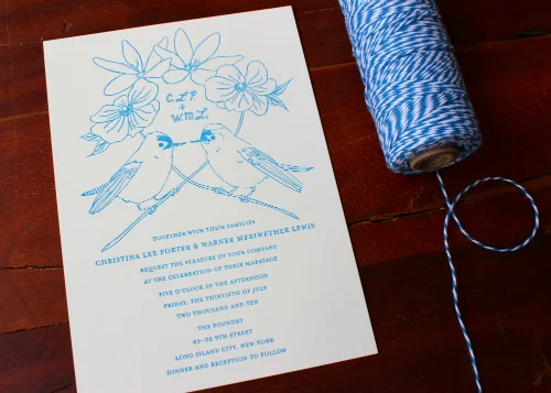
We've been looking through the Sesame Letterpress archives lately, searching for examples of pretty, whimsical hand drawn designs. We found a trio of gorgeous examples that we wanted to share on the blog today. We love how the colors of all three invitations create a perfect trio of Spring hues!
We adore the wreath illustration and the interplay of handwritten text and printed text. Also, that aqua color is just so fresh and modern!
This design just makes us smile: those two patient little pets at the bottom of the card! Any design - like this - with fine, line drawn detail prints perfectly in letterpress.
What is so clever about this design is the way that the layout of the text mirrors the criss-cross of the branches in the illustration. This example also shows how sometimes a single color ink can add a really elegant cohesive feel to the design.
Remember that we are always happy to incorporate your own hand drawn illustration into the design of your choice!
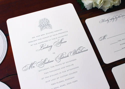
Even though all of the couples we work with have their own vision and ideas when it comes to their wedding stationery, there are a few requests that come up quite frequently. We are often asked for images and illustrations of hydrangeas. We love these flowers. Whether in white, pale green or purple-y blue they are always so pretty.Here's a suite we printed a couple of years ago for a very sweet couple:
We love the subtle ink colors and the illustration of the bunch of hydrangea is beautifully detailed:
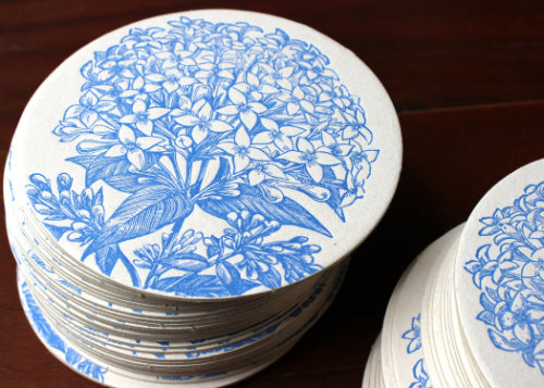
And did we mention that our set of blue hydrangea coasters would be the perfect guest favor or part of a bridesmaid gift:
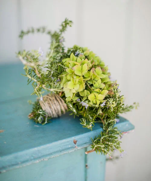
And finally, if you need a little more inspiration, how about this rustic bouquet, featuring hydrangea and rosemary:
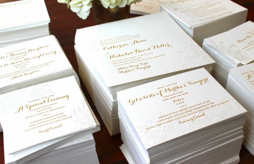
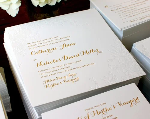
We designed this invitation set to represent a bouquet of flowers. Each card has a slightly different floral element which is subtly printed, using the palest of pale tinted ink.
The combination of fonts also adds an element of embellishment to the layout. And we adore how each card has a slightly different alignment for the florals.
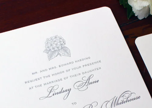
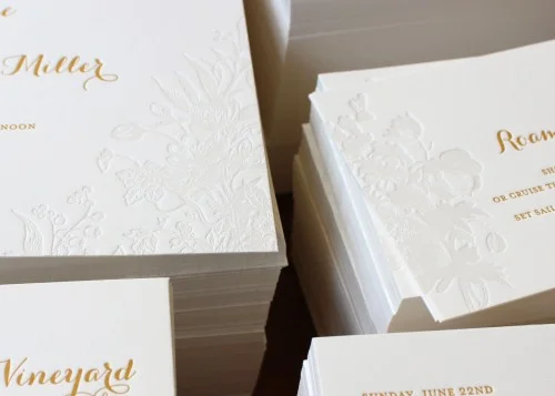
Here's one more detail of the main invitation card which highlights the fine detail in the letterpress impression. This design can be printed in your choice of colored ink and we recommend opting for the pale silver-gray tint on the floral printing.
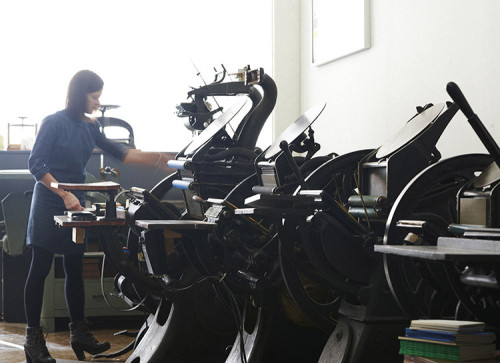
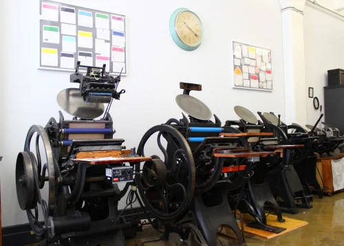
It's such a pleasure to spend out days working on beautiful old machines to create gorgeous, tactile stationery. Here are a few photos of our studio to give you a sense of what we do: