Our kind of Valentines...

January 15, 2013

Waves_sm

We think Valentine's Day is the perfect excuse to remind the people you care about just how much you care about them! Valentine's cards don't have to just be for a single loved one. We love sending mini-notecards out to our closest friends and family.

There's nothing nicer than receiving a nice handwritten note and February 14th is an especially perfect day to open up the mailbox and find something good waiting!

Unicorn_sm

With this in mind, we designed and printed these luxury notecards sets:

Box_sm

Just right for Valentine's Day...but equally good for the rest of the year!

They can be purchased directly from our online shop by clicking here.

Commissioned Coasters

January 6, 2013

Just before the holidays we were commissioned by the creative agency, Hugo and Marie, to print a range of coasters for their clients.We love working with this company because the designs are always a little quirky, surprising and naughty!

Hugo and Marie coasters

We can't choose our favorite! I kinda love the Snoop Dogg design:

Hugo and Marie 2

But actually they are all really cool:

Hugo and Marie 3

We heard from one of the staff members at Hugo and Marie that a few clients were requesting additional coasters: it's so great when we hear that a product we printed was a  big success!

Here's one more photo of the huge piles of coasters in our studio, just before we mailed them out:

hugo and marie coasters

- Jana

More notecards...

January 4, 2013

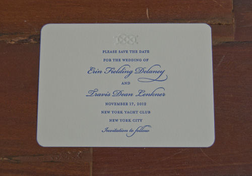
erin and travis invite

This next notecard design shows how you can re-purpose a motif from an invitation and use it on your notecards. This couple asked us to design some lovely Save the Date cards for their wedding, which featured a nautical knot blind embossed at the top:

They then got in touch with us to print them some thank you notes and again they used the knot image, this time printed in blue.

erin and travis

We love the sense of continuity that is established through using the same design components and ink colors across a whole suite of personal stationery.

- Jana

New Year, New Notecards!

January 2, 2013

It's that time in the year when I am resolving to become more organized and to stay on top of personal admin. A lot of our clients seem to have the same idea: they are getting in touch with us to order personal notecards and business cards. January is the perfect time to get your stationery needs in order and make sure you have printed items for the year ahead!So, I'm going to be posting a few blogs about some of the notecard designs we printed in 2012...starting with these gorgeous cards which feature a stunning decorative border.

Monica Herman

The black ink looks so sharp and was the perfect complement to envelopes lined in a gorgeous pale green color.

Stay tuned for more notecard ideas...

- Jana

Happy New Year!

December 31, 2012

2012 has been a great year for us here at Sesame. We have worked with some wonderful clients and companies and we have had the opportunity to get involved in some really fun and exciting collaborations.Keep visiting the blog in 2013 as we post more about our products, projects and adventures. Stay tuned for more posts about our experiences fixing up the Golding Jobber No. 7 and please do keep in touch and let us know what you think of our new items and stationery lines. We love hearing from you!

Happy New Year from everyone at Sesame Letterpress!

champagne bottle gift

Websites we love, Part 1

December 29, 2012

I wanted to share a few posts that investigate websites and blogs that we adore. The internet is such a great source of inspiration and resources to help us (and our clients!) when it comes to thinking about and designing personal stationery.First up is Color Collective. The concept is really simple: Lauren Willhite posts a single image and then includes swatches of the main colors which are featured:

It might be an interior snapshot or a fashion image:

03-KrakvikandDOrazio

04-carven

Or much more random images:

01-anthro

03-soap

The idea is that you get a sense of the way that seemingly disparate colors can actually look fantastic together. Brides who are looking for an unusual palette for their wedding colors could really benefit from checking out this website!

- Jana

Sesame Letterpress on Martha Stewart Weddings!

December 27, 2012

invitation-068-mwd109006_vert

escortcard-008-mwd109006_vert

We really love being featured in any Martha Stewart magazine or website. We are over the moon to have our stationery included in a photo story about Justine and Eamonn's wedding. They are a really glamorous couple (just check out her stunning Jenny Packham wedding dress - swoon!). So we wanted to work with them to design an invitation and stationery suite that would reflect the vibe of their summertime New York wedding.

We especially love the bespoke coat of arms that features on the invitation! It was designed especially to reflect the couple...

See more photos from this gorgeous wedding by clicking here.

Nearly New Year's Eve!

December 19, 2012

Well, admittedly we're not even past Christmas yet. But we're thinking ahead! And we do love a good New Year's Eve Party...I've been going through our stock and I think I have found the perfect card to use as an invitation or to say a festive thanks for gifts and fun events.

A6P_Tray

I love the slightly old-fashioned image of a drinks tray, especially the way it has been modernized with flashes of bright yellow. Being British, I also like the greeting, "cheers", printed underneath!

Here's a close up:

A6P_Tray_detail

What do you think? If you want to purchase a few of these for your New Year's party, just click here!