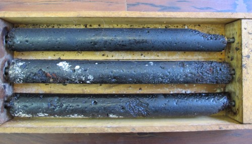
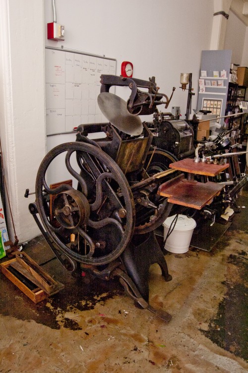
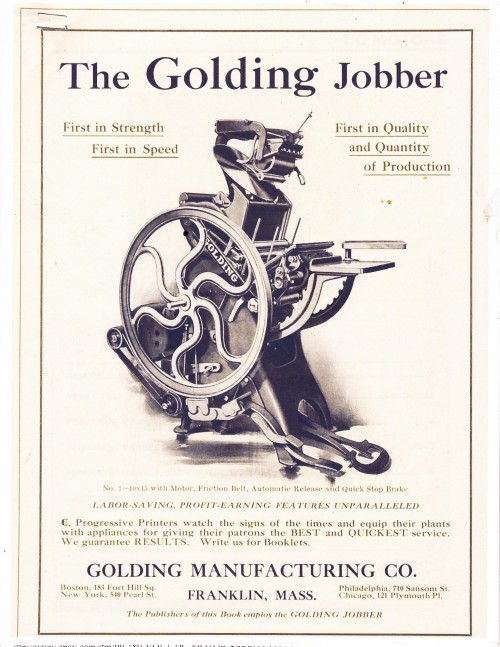
The Golding Jobber No. 7: The rollers
Before Kate gets started fixing up our letterpress, she did a thorough audit of all the parts to see what was redeemable and which bits of kit had reached the end of their lifespan.Sadly, the rollers were just not up to scratch. The material had decomposed - most likely from lack of use. That said, letterpress rollers usually need to be replaced around every ten years so we expected that this would be a spare part we would have to factor in.

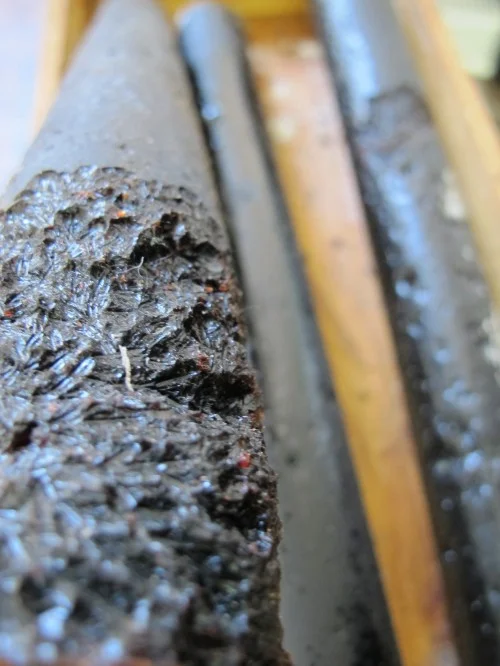
Yikes: it almost looks like a small animal has been gnawing on the rollers: here's a close-up of one of them:

Interestingly, the Golding Jobber holds three rollers, but we often print using just two and the results are the same.
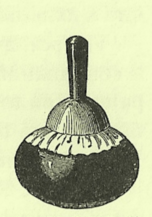
The purpose of the rollers is to transfer ink onto the plate, which is then pressed into the paper stock, leaving a de-bossed mark. Since the beginning of letterpress, the concern has always been how to ensure that ink is transferred with consistency and equal pressure. In the very early stages, printers applied the ink manually, using something called an ink ball or dabber which consisted of a wooden handle and sheepskin bag filled with horsehair:

In 1818, Robert Harrild developed the first ‘composition roller’, made of glue (from calfskins) and treacle. Needless to say, though this was an improvement on the dabber, it was still not ideal. Luckily, in the intervening years, the materials used for rollers have improved and they now have a much longer lifespan (and they are not made from treacle!)
- Jana


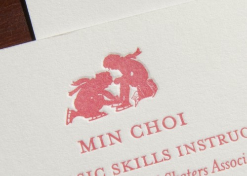
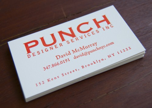
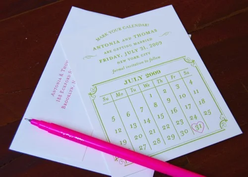
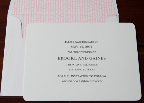